/* Roel J. Hotz — personal site
   Bauhaus poster meets Guy Billout. Bold geometric grid,
   primary red/blue/yellow on off-white, asymmetric type.
   Multi-page: Home / Work / Photos / CV / Contact via hash routing.
*/

const WerkblattC = () => {
  const [theme, setTheme] = React.useState('light');
  const dark = theme === 'dark';

  // Hash-based routing
  const getRoute = () => {
    const h = (window.location.hash || '#home').replace('#', '');
    if (['home', 'work', 'photos', 'cv', 'contact'].includes(h)) return h;
    if (/^project-(0[1-5])$/.test(h)) return h;
    if (/^question-(0[1-2])$/.test(h)) return h;
    return 'home';
  };
  const [route, setRoute] = React.useState(getRoute());
  React.useEffect(() => {
    const onHash = () => {setRoute(getRoute());window.scrollTo(0, 0);};
    window.addEventListener('hashchange', onHash);
    return () => window.removeEventListener('hashchange', onHash);
  }, []);

  const palette = dark ?
  { paper: '#13130F', ink: '#EFEAD8', muted: '#76726A', red: '#E64528', blue: '#2454C2', yellow: '#F0C13A', card: '#1B1B16', rule: '#2B2A24' } :
  { paper: '#F0EBDD', ink: '#15140F', muted: '#5C584F', red: '#D63A1A', blue: '#1E47B8', yellow: '#E8B528', card: '#FFFFFF', rule: '#15140F' };

  const css = `
    .wk-root { background: ${palette.paper}; color: ${palette.ink}; font-family: 'Inter', 'Helvetica Neue', sans-serif; min-height: 100vh; padding: 0; position: relative; overflow-x: hidden; display: flex; flex-direction: column; }
    .wk-root * { box-sizing: border-box; }
    .wk-main { flex: 1; }

    /* HEADER */
    .wk-header { display: grid; grid-template-rows: 80px; align-items: stretch; border-bottom: 3px solid ${palette.ink}; }
    .wk-header.with-name { grid-template-columns: 80px auto 1fr 80px; }
    .wk-header.no-name { grid-template-columns: 80px 1fr 80px; }
    .wk-header > div { display: flex; align-items: center; padding: 0 20px; border-right: 1.5px solid ${palette.ink}; }
    .wk-header > div:last-child { border-right: none; }
    .wk-header-name { font-family: 'Spectral', serif; font-size: 22px; letter-spacing: -0.01em; font-weight: 400; padding: 0 28px !important; border-right: none !important; }
    .wk-mark { background: ${palette.red}; color: ${palette.paper}; justify-content: center !important; font-family: 'Spectral', serif; font-size: 36px; padding: 0 !important; cursor: pointer; transition: background .15s; }
    .wk-mark:hover { background: ${palette.ink}; }
    .wk-nav { gap: 28px; justify-content: flex-end; font-size: 12px; letter-spacing: 0.15em; text-transform: uppercase; }
    .wk-nav a { color: inherit; text-decoration: none; padding-bottom: 1px; border-bottom: 1.5px solid transparent; transition: color .15s, border-color .15s; }
    .wk-nav a:hover { border-bottom-color: ${palette.red}; }
    .wk-nav a.active { color: ${palette.red}; border-bottom-color: ${palette.red}; }
    .wk-toggle { background: ${palette.yellow}; color: ${palette.ink}; justify-content: center !important; cursor: pointer; font-weight: 600; font-size: 14px; padding: 0 !important; user-select: none; transition: background .15s; }
    .wk-toggle:hover { background: ${palette.red}; color: ${palette.paper}; }

    /* NAME BAR */
    .wk-namebar { padding: 28px 32px; border-bottom: 3px solid ${palette.ink}; font-family: 'Spectral', serif; font-size: 48px; line-height: 1; letter-spacing: -0.015em; font-weight: 400; }
    .wk-namebar .dot { color: ${palette.red}; }

    /* PAGE TITLE BAR (work / photos / cv / contact) */
    .wk-pagetitle { display: grid; grid-template-columns: 240px 1fr auto; align-items: end; padding: 56px 48px 32px; border-bottom: 1.5px solid ${palette.ink}; gap: 32px; }
    .wk-pagetitle .num-block { display: flex; align-items: baseline; gap: 16px; }
    .wk-pagetitle .num-block .circle { width: 48px; height: 48px; border-radius: 50%; display: grid; place-items: center; font-family: 'JetBrains Mono', monospace; font-size: 14px; }
    .wk-pagetitle .num-block .label { font-family: 'JetBrains Mono', monospace; font-size: 11px; letter-spacing: 0.2em; text-transform: uppercase; color: ${palette.muted}; }
    .wk-pagetitle h2 { font-family: 'Spectral', serif; font-size: 64px; line-height: 0.95; margin: 0; letter-spacing: -0.015em; font-weight: 400; }
    .wk-pagetitle h2 .alt { color: ${palette.red}; font-style: italic; }
    .wk-pagetitle .meta { font-family: 'JetBrains Mono', monospace; font-size: 11px; letter-spacing: 0.15em; text-transform: uppercase; color: ${palette.muted}; text-align: right; line-height: 1.6; }

    /* HERO */
    .wk-hero { display: grid; grid-template-columns: 1fr 480px; min-height: 540px; border-bottom: 3px solid ${palette.ink}; }
    .wk-hero-c { padding: 56px 56px 48px; border-right: 1.5px solid ${palette.ink}; display: flex; flex-direction: column; justify-content: space-between; }
    .wk-kicker { font-family: 'JetBrains Mono', monospace; font-size: 11px; letter-spacing: 0.2em; text-transform: uppercase; color: ${palette.red}; margin-bottom: 24px; display: flex; align-items: center; gap: 12px; }
    .wk-kicker::before { content: ""; width: 24px; height: 24px; background: ${palette.red}; border-radius: 50%; }
    .wk-headline { font-family: 'Spectral', serif; font-size: 96px; line-height: 0.92; letter-spacing: -0.025em; margin: 0; font-weight: 400; }
    .wk-headline .red { color: ${palette.red}; font-style: italic; }
    .wk-headline .yellow-block { background: ${palette.yellow}; color: ${palette.ink}; padding: 0 12px; font-style: italic; }
    .wk-blurb { font-size: 15px; line-height: 1.55; color: ${palette.muted}; max-width: 44ch; margin-top: 32px; }
    .wk-blurb strong { color: ${palette.ink}; font-weight: 500; }
    .wk-blurb-meet { font-family: 'Spectral', serif; font-size: 16px; line-height: 1.5; color: ${palette.ink}; max-width: 44ch; margin: 16px 0 0; font-style: italic; }
    .wk-blurb-meet a { color: ${palette.red}; text-decoration: none; border-bottom: 1px solid ${palette.red}; }
    .wk-blurb-meet a:hover { background: ${palette.red}; color: ${palette.paper}; }
    .wk-hero-r { background: ${palette.yellow}; position: relative; min-height: 540px; }
    .wk-hero-r .photo-frame { position: absolute; inset: 40px; border: 4px solid ${palette.ink}; overflow: hidden; background: ${palette.card}; }
    .wk-hero-r .photo-frame img { width: 100%; height: 100%; object-fit: cover; filter: ${dark ? 'brightness(0.85)' : 'contrast(1.05)'}; }
    .wk-hero-r .photo-frame.placeholder::after { content: "Portrait · pending"; position: absolute; inset: 0; display: grid; place-items: center; font-family: 'JetBrains Mono', monospace; font-size: 12px; letter-spacing: 0.15em; text-transform: uppercase; color: ${palette.muted}; background: repeating-linear-gradient(45deg, ${palette.card}, ${palette.card} 12px, ${palette.paper} 12px, ${palette.paper} 24px); }
    .wk-hero-r .corner-circle { position: absolute; bottom: -28px; right: -28px; width: 90px; height: 90px; background: ${palette.red}; border-radius: 50%; border: 4px solid ${palette.paper}; }

    /* TWO-COLUMN BLOCK (open questions / explore) */
    .wk-twocol { display: grid; grid-template-columns: 1fr 1fr; border-bottom: 3px solid ${palette.ink}; }
    .wk-twocol > section { padding: 48px 48px 56px; }
    .wk-twocol > section.left { border-right: 1.5px solid ${palette.ink}; }
    .wk-twocol h3 { font-family: 'Spectral', serif; font-size: 36px; line-height: 1; margin: 0 0 28px; font-weight: 400; display: flex; align-items: baseline; gap: 14px; }
    .wk-twocol h3 .num { font-family: 'JetBrains Mono', monospace; font-size: 11px; letter-spacing: 0.2em; color: ${palette.red}; }
    .wk-twocol h3 em { font-style: italic; color: ${palette.red}; }
    .wk-questions { list-style: none; padding: 0; margin: 0; }
    .wk-questions li { font-family: 'Spectral', serif; font-size: 19px; line-height: 1.4; padding: 16px 0 16px 28px; border-bottom: 1px solid ${palette.rule}; position: relative; }
    .wk-questions li::before { content: "?"; position: absolute; left: 0; top: 14px; font-family: 'Spectral', serif; font-style: italic; color: ${palette.red}; font-size: 22px; }
    .wk-questions li:last-child { border-bottom: none; }
    .wk-questions li a { color: inherit; text-decoration: none; display: block; transition: color .15s, transform .2s; }
    .wk-questions li a:hover { color: ${palette.red}; transform: translateX(6px); }

    /* CV PORTRAIT */
    .cv-portrait { width: 100%; aspect-ratio: 4 / 5; margin-bottom: 28px; border: 2px solid ${palette.yellow}; }
    .cv-portrait image-slot { width: 100%; height: 100%; }

    /* QUESTION PAGE */
    .wk-q-back { padding: 20px 48px; border-bottom: 1.5px solid ${palette.ink}; font-family: 'JetBrains Mono', monospace; font-size: 11px; letter-spacing: 0.18em; text-transform: uppercase; }
    .wk-q-back a { color: inherit; text-decoration: none; border-bottom: 1px solid transparent; }
    .wk-q-back a:hover { color: ${palette.red}; border-bottom-color: ${palette.red}; }
    .wk-q-back .sep { color: ${palette.muted}; margin: 0 12px; }
    .wk-q-hero { padding: 80px 56px 64px; border-bottom: 3px solid ${palette.ink}; display: grid; grid-template-columns: 80px 1fr; gap: 32px; align-items: start; }
    .wk-q-hero .mark { width: 80px; height: 80px; border-radius: 50%; background: ${palette.red}; color: ${palette.paper}; display: grid; place-items: center; font-family: 'Spectral', serif; font-style: italic; font-size: 60px; line-height: 1; }
    .wk-q-hero .text { display: flex; flex-direction: column; gap: 18px; }
    .wk-q-hero .kicker { font-family: 'JetBrains Mono', monospace; font-size: 11px; letter-spacing: 0.22em; text-transform: uppercase; color: ${palette.red}; }
    .wk-q-hero h1 { font-family: 'Spectral', serif; font-size: 64px; line-height: 1; letter-spacing: -0.02em; margin: 0; font-weight: 400; }
    .wk-q-hero h1 em { color: ${palette.red}; font-style: italic; }
    .wk-q-body { display: grid; grid-template-columns: 1fr 360px; border-bottom: 3px solid ${palette.ink}; }
    .wk-q-body.single { grid-template-columns: 1fr; }
    .wk-q-body.single .essay { border-right: none; max-width: 920px; margin: 0 auto; }
    .wk-q-body .essay { padding: 56px; border-right: 1.5px solid ${palette.ink}; max-width: none; }
    .wk-q-body .essay h3 { font-family: 'Spectral', serif; font-size: 24px; line-height: 1.1; margin: 32px 0 14px; font-weight: 500; display: flex; align-items: baseline; gap: 14px; }
    .wk-q-body .essay h3:first-child { margin-top: 0; }
    .wk-q-body .essay h3 .num { font-family: 'JetBrains Mono', monospace; font-size: 11px; letter-spacing: 0.2em; color: ${palette.red}; }
    .wk-q-body .essay p { font-family: 'Spectral', serif; font-size: 19px; line-height: 1.6; margin: 0 0 18px; max-width: 60ch; }
    .wk-q-body .essay p strong { font-weight: 500; }
    .wk-q-body .essay blockquote { font-family: 'Spectral', serif; font-style: italic; font-size: 22px; line-height: 1.4; margin: 28px 0; padding-left: 24px; border-left: 3px solid ${palette.red}; color: ${palette.ink}; }
    .wk-q-body .aside { padding: 56px 36px; background: ${palette.yellow}; color: ${palette.ink}; display: flex; flex-direction: column; gap: 32px; }
    .wk-q-body .aside section h5 { font-family: 'JetBrains Mono', monospace; font-size: 10px; letter-spacing: 0.22em; text-transform: uppercase; color: ${palette.ink}; opacity: 0.65; margin: 0 0 10px; }
    .wk-q-body .aside section p, .wk-q-body .aside section li { font-family: 'Spectral', serif; font-size: 15px; line-height: 1.5; margin: 0; }
    .wk-q-body .aside ul { list-style: none; padding: 0; margin: 0; display: flex; flex-direction: column; gap: 6px; }
    .wk-q-body .aside ul li::before { content: "— "; color: ${palette.red}; }
    .wk-q-next { padding: 36px 48px; display: flex; justify-content: space-between; align-items: baseline; gap: 24px; }
    .wk-q-next a { color: inherit; text-decoration: none; font-family: 'JetBrains Mono', monospace; font-size: 11px; letter-spacing: 0.2em; text-transform: uppercase; border-bottom: 1px solid transparent; padding-bottom: 2px; }
    .wk-q-next a:hover { color: ${palette.red}; border-bottom-color: ${palette.red}; }
    .wk-q-next .ttl { font-family: 'Spectral', serif; font-style: italic; font-size: 18px; text-transform: none; letter-spacing: 0; margin-left: 12px; color: ${palette.muted}; }
    .wk-explore { display: flex; flex-direction: column; gap: 0; }
    .wk-explore a { display: grid; grid-template-columns: 1fr auto; gap: 16px; align-items: baseline; padding: 18px 0; border-bottom: 1px solid ${palette.rule}; color: inherit; text-decoration: none; transition: padding-left .2s, color .2s; }
    .wk-explore a:last-child { border-bottom: none; }
    .wk-explore a:hover { padding-left: 12px; color: ${palette.red}; }
    .wk-explore .ix { font-family: 'JetBrains Mono', monospace; font-size: 11px; letter-spacing: 0.18em; color: ${palette.muted}; }
    .wk-explore .ttl { font-family: 'Spectral', serif; font-size: 22px; line-height: 1.2; }
    .wk-explore .ttl small { display: block; font-family: 'Inter', sans-serif; font-style: normal; font-size: 11px; letter-spacing: 0.1em; text-transform: uppercase; color: ${palette.muted}; margin-top: 4px; }
    .wk-explore .arr { font-family: 'Spectral', serif; font-size: 24px; }

    /* PROJECTS */
    .wk-projects { display: grid; grid-template-columns: repeat(12, 1fr); }
    .wk-plate { grid-column: span 6; padding: 36px; border-right: 1.5px solid ${palette.ink}; border-bottom: 1.5px solid ${palette.ink}; cursor: pointer; transition: background .25s; position: relative; min-height: 280px; display: flex; flex-direction: column; color: inherit; text-decoration: none; }
    .wk-plate:nth-child(2n) { border-right: none; }
    .wk-plate:hover { background: ${palette.yellow}; color: ${palette.ink}; }
    .wk-plate:hover .wk-plate-arrow { transform: translate(6px, -6px); }
    .wk-plate .top { display: flex; justify-content: space-between; align-items: flex-start; margin-bottom: auto; }
    .wk-plate-num { font-family: 'JetBrains Mono', monospace; font-size: 12px; letter-spacing: 0.2em; }
    .wk-plate-arrow { font-family: 'Spectral', serif; font-size: 32px; transition: transform .25s; }
    .wk-plate-icon { margin: 24px 0; height: 120px; display: flex; align-items: center; }
    .wk-plate h3 { font-family: 'Spectral', serif; font-size: 32px; line-height: 1.05; margin: 0 0 6px; font-weight: 400; }
    .wk-plate .meta { font-family: 'JetBrains Mono', monospace; font-size: 11px; letter-spacing: 0.1em; text-transform: uppercase; color: ${palette.muted}; margin-bottom: 12px; }
    .wk-plate p { font-size: 14px; line-height: 1.55; margin: 0; max-width: 42ch; }

    /* PROJECT DETAIL */
    .wk-proj-back { padding: 20px 48px; border-bottom: 1.5px solid ${palette.ink}; font-family: 'JetBrains Mono', monospace; font-size: 11px; letter-spacing: 0.18em; text-transform: uppercase; }
    .wk-proj-back a { color: inherit; text-decoration: none; border-bottom: 1px solid transparent; }
    .wk-proj-back a:hover { color: ${palette.red}; border-bottom-color: ${palette.red}; }
    .wk-proj-back .sep { color: ${palette.muted}; margin: 0 12px; }
    .wk-proj-hero { display: grid; grid-template-columns: 1.1fr 1fr; border-bottom: 3px solid ${palette.ink}; min-height: 480px; }
    .wk-proj-hero .left { padding: 56px; border-right: 1.5px solid ${palette.ink}; display: flex; flex-direction: column; justify-content: space-between; gap: 32px; }
    .wk-proj-hero .kicker { font-family: 'JetBrains Mono', monospace; font-size: 11px; letter-spacing: 0.2em; text-transform: uppercase; color: ${palette.red}; display: flex; align-items: center; gap: 14px; }
    .wk-proj-hero .kicker .badge { background: ${palette.red}; color: ${palette.paper}; padding: 4px 10px; font-weight: 500; }
    .wk-proj-hero h1 { font-family: 'Spectral', serif; font-size: 80px; line-height: 0.95; letter-spacing: -0.025em; margin: 0; font-weight: 400; }
    .wk-proj-hero h1 em { font-style: italic; color: ${palette.red}; }
    .wk-proj-hero .lead { font-family: 'Spectral', serif; font-size: 22px; line-height: 1.45; max-width: 46ch; margin: 0; color: ${palette.ink}; }
    .wk-proj-hero .right { background: ${palette.yellow}; position: relative; display: grid; place-items: center; }
    .wk-proj-hero .right .frame { width: 70%; aspect-ratio: 1 / 1; border: 4px solid ${palette.ink}; background: ${palette.card}; display: grid; place-items: center; }
    .wk-proj-hero .right .corner { position: absolute; bottom: -28px; left: -28px; width: 90px; height: 90px; background: ${palette.red}; border-radius: 50%; border: 4px solid ${palette.paper}; }

    .wk-proj-meta { display: grid; grid-template-columns: repeat(4, 1fr); border-bottom: 3px solid ${palette.ink}; }
    .wk-proj-meta.two { grid-template-columns: 1fr 1fr; }
    .wk-proj-meta > div { padding: 24px 32px; border-right: 1.5px solid ${palette.ink}; }
    .wk-proj-meta > div:last-child { border-right: none; }
    .wk-proj-meta h5 { font-family: 'JetBrains Mono', monospace; font-size: 10px; letter-spacing: 0.22em; text-transform: uppercase; color: ${palette.muted}; margin: 0 0 8px; }
    .wk-proj-meta p { font-family: 'Spectral', serif; font-size: 18px; line-height: 1.3; margin: 0; }

    .wk-proj-body { display: grid; grid-template-columns: 1.4fr 1fr; border-bottom: 3px solid ${palette.ink}; }
    .wk-proj-body.single { grid-template-columns: 1fr; }
    .wk-proj-body.single .narrative { border-right: none; padding: 64px 56px; max-width: 920px; margin: 0 auto; }
    .wk-proj-body .narrative { padding: 56px; border-right: 1.5px solid ${palette.ink}; }
    .wk-proj-body .narrative h3 { font-family: 'Spectral', serif; font-size: 32px; margin: 0 0 24px; font-weight: 400; line-height: 1; display: flex; align-items: baseline; gap: 14px; }
    .wk-proj-body .narrative h3 em { color: ${palette.red}; font-style: italic; }
    .wk-proj-body .narrative h3 .num { font-family: 'JetBrains Mono', monospace; font-size: 11px; letter-spacing: 0.2em; color: ${palette.red}; }
    .wk-proj-body .narrative p { font-family: 'Spectral', serif; font-size: 19px; line-height: 1.55; margin: 0 0 20px; max-width: 56ch; }
    .wk-proj-body .narrative p:last-child { margin-bottom: 0; }
    .wk-proj-body .specs { padding: 56px; background: ${palette.ink}; color: ${palette.paper}; }
    .wk-proj-body .specs h3 { font-family: 'Spectral', serif; font-size: 28px; margin: 0 0 24px; font-weight: 400; line-height: 1; }
    .wk-proj-body .specs h3 em { color: ${palette.yellow}; font-style: italic; }
    .wk-proj-body .specs .row { display: flex; justify-content: space-between; align-items: baseline; padding: 14px 0; border-bottom: 1px solid #ffffff22; gap: 24px; }
    .wk-proj-body .specs .row:last-child { border-bottom: none; }
    .wk-proj-body .specs .row .k { font-family: 'JetBrains Mono', monospace; font-size: 11px; letter-spacing: 0.18em; text-transform: uppercase; color: ${palette.yellow}; opacity: 0.85; }
    .wk-proj-body .specs .row .v { font-family: 'Spectral', serif; font-size: 17px; text-align: right; }

    .wk-proj-process { padding: 56px; border-bottom: 3px solid ${palette.ink}; }
    .wk-proj-process h3 { font-family: 'Spectral', serif; font-size: 32px; margin: 0 0 32px; font-weight: 400; line-height: 1; display: flex; align-items: baseline; gap: 14px; }
    .wk-proj-process h3 em { color: ${palette.red}; font-style: italic; }
    .wk-proj-process h3 .num { font-family: 'JetBrains Mono', monospace; font-size: 11px; letter-spacing: 0.2em; color: ${palette.red}; }
    .wk-proj-process .steps { display: grid; grid-template-columns: repeat(5, 1fr); gap: 0; border-top: 1.5px solid ${palette.ink}; border-left: 1.5px solid ${palette.ink}; }
    .wk-proj-process .step { padding: 24px; border-right: 1.5px solid ${palette.ink}; border-bottom: 1.5px solid ${palette.ink}; min-height: 200px; display: flex; flex-direction: column; gap: 12px; transition: background .2s; }
    .wk-proj-process .step:hover { background: ${palette.yellow}; }
    .wk-proj-process .step .n { font-family: 'JetBrains Mono', monospace; font-size: 11px; letter-spacing: 0.2em; color: ${palette.red}; }
    .wk-proj-process .step .t { font-family: 'Spectral', serif; font-size: 16px; line-height: 1.4; }

    .wk-proj-next { display: grid; grid-template-columns: 1fr 1fr; border-bottom: 3px solid ${palette.ink}; }
    .wk-proj-next a { padding: 36px 48px; color: inherit; text-decoration: none; display: flex; flex-direction: column; gap: 8px; transition: background .25s; }
    .wk-proj-next a:hover { background: ${palette.yellow}; }
    .wk-proj-next a.prev { border-right: 1.5px solid ${palette.ink}; }
    .wk-proj-next a.next { text-align: right; align-items: flex-end; }
    .wk-proj-next .lbl { font-family: 'JetBrains Mono', monospace; font-size: 10px; letter-spacing: 0.22em; text-transform: uppercase; color: ${palette.muted}; }
    .wk-proj-next .ttl { font-family: 'Spectral', serif; font-size: 24px; line-height: 1.2; }

    /* PROJECT GALLERY */
    .wk-proj-gallery { padding: 56px; border-bottom: 3px solid ${palette.ink}; }
    .wk-proj-gallery .gallery-head { display: flex; justify-content: space-between; align-items: baseline; margin-bottom: 32px; gap: 24px; }
    .wk-proj-gallery .gallery-head h3 { font-family: 'Spectral', serif; font-size: 32px; margin: 0; font-weight: 400; line-height: 1; display: flex; align-items: baseline; gap: 14px; }
    .wk-proj-gallery .gallery-head h3 em { color: ${palette.red}; font-style: italic; }
    .wk-proj-gallery .gallery-head h3 .num { font-family: 'JetBrains Mono', monospace; font-size: 11px; letter-spacing: 0.2em; color: ${palette.red}; }
    .wk-proj-gallery .gallery-head .hint { font-family: 'JetBrains Mono', monospace; font-size: 10px; letter-spacing: 0.22em; text-transform: uppercase; color: ${palette.muted}; }
    .wk-proj-gallery .gallery-grid { display: grid; grid-template-columns: 1fr; gap: 48px; max-width: 760px; margin: 0 auto; }
    .wk-proj-gallery .gallery-grid .wk-photo-nat { margin: 0; position: relative; overflow: visible; }
    .wk-proj-gallery .gallery-grid image-slot { display: block; width: 100%; background: transparent; }
    .wk-proj-gallery .gallery-grid .wk-photo-nat img { display: block; width: 100%; height: auto; }
    .wk-proj-gallery .gallery-grid .wk-photo-nat video { display: block; width: 100%; height: auto; background: #000; }
    .wk-proj-gallery .gallery-grid .wk-photo-nat figcaption { position: static; opacity: 1; transform: none; background: transparent; color: ${palette.muted}; padding: 12px 0 0; display: flex; justify-content: space-between; gap: 24px; font-family: 'JetBrains Mono', monospace; font-size: 10px; letter-spacing: 0.22em; text-transform: uppercase; }
    .wk-proj-gallery .gallery-grid .wk-photo-nat figcaption .loc { color: ${palette.ink}; }
    .wk-proj-gallery .gallery-caption { background: ${palette.ink}; color: ${palette.paper}; padding: 24px; display: flex; flex-direction: column; justify-content: space-between; gap: 12px; }
    .wk-proj-gallery .gallery-caption .caption-num { font-family: 'JetBrains Mono', monospace; font-size: 11px; letter-spacing: 0.22em; color: ${palette.yellow}; }
    .wk-proj-gallery .gallery-caption .caption-text { font-family: 'Spectral', serif; font-style: italic; font-size: 22px; line-height: 1.2; }

    /* PHOTO INTRO */
    .wk-photo-intro { display: grid; grid-template-columns: 1.4fr 1fr; border-bottom: 3px solid ${palette.ink}; }
    .wk-photo-intro .left { padding: 56px; border-right: 1.5px solid ${palette.ink}; }
    .wk-photo-intro .right { padding: 56px; background: ${palette.yellow}; color: ${palette.ink}; }
    .wk-photo-intro h3 { font-family: 'Spectral', serif; font-size: 36px; line-height: 1; margin: 0 0 24px; font-weight: 400; }
    .wk-photo-intro h3 em { color: ${palette.red}; font-style: italic; }
    .wk-photo-intro p { font-family: 'Spectral', serif; font-size: 18px; line-height: 1.55; max-width: 52ch; margin: 0 0 18px; color: ${palette.ink}; }
    .wk-photo-intro p:last-child { margin-bottom: 0; color: ${palette.muted}; font-size: 15px; font-style: italic; }
    .wk-photo-meta { display: flex; justify-content: space-between; align-items: baseline; padding: 14px 0; border-bottom: 1px solid #15140f33; gap: 24px; }
    .wk-photo-meta:last-child { border-bottom: none; }
    .wk-photo-meta span { font-family: 'JetBrains Mono', monospace; font-size: 11px; letter-spacing: 0.18em; text-transform: uppercase; flex-shrink: 0; padding-top: 2px; }
    .wk-photo-meta strong { font-family: 'Spectral', serif; font-size: 16px; font-weight: 400; text-align: right; line-height: 1.45; }

    /* GALLERY — natural aspect ratios */
    .wk-gallery-cols { display: grid; grid-template-columns: 1fr 1fr; gap: 32px; padding: 56px; background: ${palette.paper}; }
    .wk-gallery-cols .col { display: flex; flex-direction: column; gap: 32px; }
    .wk-photo-nat { margin: 0; position: relative; overflow: hidden; }
    .wk-photo-nat img { width: 100%; height: auto; display: block; }
    .wk-photo-nat figcaption { position: absolute; left: 0; right: 0; bottom: 0; padding: 16px 22px; background: rgba(21,20,15,0.92); color: ${palette.paper}; font-family: 'JetBrains Mono', monospace; font-size: 11px; letter-spacing: 0.14em; text-transform: uppercase; display: flex; justify-content: space-between; align-items: baseline; gap: 16px; opacity: 0; transform: translateY(8px); transition: opacity .35s ease, transform .35s ease; }
    .wk-photo-nat:hover figcaption, .wk-photo-nat:focus-within figcaption { opacity: 1; transform: translateY(0); }
    .wk-photo-nat figcaption .loc { color: ${palette.paper}; }
    .wk-photo-nat figcaption .med { color: ${palette.paper}; opacity: 0.7; }

    /* (legacy gallery classes — kept harmless) */
    .wk-photo { position: relative; overflow: hidden; }
    .wk-photo img { width: 100%; height: 100%; object-fit: cover; transition: transform .5s; }
    .wk-photo .tag { position: absolute; top: 12px; left: 12px; background: ${palette.paper}; color: ${palette.ink}; padding: 4px 10px; font-family: 'JetBrains Mono', monospace; font-size: 10px; letter-spacing: 0.1em; }
    .wk-photo .cap { position: absolute; bottom: 12px; right: 12px; background: ${palette.ink}; color: ${palette.paper}; padding: 4px 10px; font-family: 'JetBrains Mono', monospace; font-size: 10px; letter-spacing: 0.1em; }
    .wk-empty { background: ${palette.blue}; border-right: 1.5px solid ${palette.ink}; border-bottom: 1.5px solid ${palette.ink}; }
    .wk-empty.red { background: ${palette.red}; }
    .wk-empty.yellow { background: ${palette.yellow}; }
    .wk-empty.paper { background: ${palette.paper}; display: grid; place-items: center; padding: 16px; }
    .wk-empty.paper .label { font-family: 'Spectral', serif; font-style: italic; font-size: 16px; color: ${palette.ink}; text-align: center; line-height: 1.3; }

    /* CV */
    .wk-cv { display: grid; grid-template-columns: 320px 1fr; }
    .wk-cv-side { background: ${palette.ink}; color: ${palette.paper}; padding: 48px 36px; }
    .wk-cv-side .ident-name { font-family: 'Spectral', serif; font-size: 32px; line-height: 1.05; margin: 0 0 28px; font-weight: 400; }
    .wk-cv-side h4 { font-family: 'JetBrains Mono', monospace; font-size: 10px; letter-spacing: 0.22em; text-transform: uppercase; margin: 0 0 10px; color: ${palette.yellow}; }
    .wk-cv-side .ident-block { margin-bottom: 28px; }
    .wk-cv-side .ident-block p { margin: 0; font-size: 14px; line-height: 1.5; opacity: 0.92; }
    .wk-cv-side .ident-block a { color: inherit; text-decoration: none; border-bottom: 1px solid ${palette.yellow}66; }
    .wk-cv-side .ident-block a:hover { color: ${palette.yellow}; }
    .wk-cv-side .lang-row { display: flex; justify-content: space-between; align-items: baseline; padding: 8px 0; border-bottom: 1px solid #ffffff1a; font-size: 14px; }
    .wk-cv-side .lang-row:last-child { border-bottom: none; }
    .wk-cv-side .lang-row span:last-child { font-family: 'JetBrains Mono', monospace; font-size: 11px; letter-spacing: 0.1em; text-transform: uppercase; opacity: 0.7; }
    .wk-cv-side .skill-group { padding: 10px 0; border-bottom: 1px solid #ffffff1a; }
    .wk-cv-side .skill-group:last-child { border-bottom: none; }
    .wk-cv-side .skill-label { font-family: 'JetBrains Mono', monospace; font-size: 10px; letter-spacing: 0.18em; text-transform: uppercase; color: ${palette.yellow}; opacity: 0.85; margin-bottom: 4px; }
    .wk-cv-side .skill-group p { margin: 0; font-size: 13px; line-height: 1.5; opacity: 0.92; }

    .wk-cv-list { padding: 48px; }
    .wk-cv-section { margin-bottom: 48px; }
    .wk-cv-section:last-child { margin-bottom: 0; }
    .wk-cv-section > .head { display: flex; align-items: baseline; gap: 14px; margin-bottom: 20px; padding-bottom: 12px; border-bottom: 2px solid ${palette.ink}; }
    .wk-cv-section > .head .num { font-family: 'JetBrains Mono', monospace; font-size: 11px; letter-spacing: 0.2em; color: ${palette.red}; }
    .wk-cv-section > .head h3 { font-family: 'Spectral', serif; font-size: 28px; margin: 0; font-weight: 400; line-height: 1; }
    .wk-cv-row { display: grid; grid-template-columns: 110px 1fr 180px; gap: 24px; padding: 18px 0; border-bottom: 1px solid ${palette.rule}; align-items: baseline; }
    .wk-cv-row:last-child { border-bottom: none; }
    .wk-cv-row .yr { font-family: 'JetBrains Mono', monospace; font-size: 12px; color: ${palette.red}; letter-spacing: 0.05em; }
    .wk-cv-row .what { font-family: 'Spectral', serif; font-size: 20px; line-height: 1.25; }
    .wk-cv-row .what em { font-style: italic; color: ${palette.muted}; font-size: 13px; display: block; margin-top: 4px; line-height: 1.45; }
    .wk-cv-row .place { font-size: 11px; letter-spacing: 0.12em; text-transform: uppercase; color: ${palette.muted}; text-align: right; }

    /* CONTACT */
    .wk-contact { display: grid; grid-template-columns: 1fr 1fr; min-height: 540px; }
    .wk-contact-l { padding: 64px 56px; border-right: 1.5px solid ${palette.ink}; display: flex; flex-direction: column; justify-content: flex-start; gap: 32px; }
    .wk-contact-l h3 { font-family: 'Spectral', serif; font-size: 56px; line-height: 1; margin: 0 0 32px; font-weight: 400; }
    .wk-contact-l h3 em { color: ${palette.red}; font-style: italic; }
    .wk-contact-l .mail { font-family: 'Spectral', serif; font-size: 36px; color: ${palette.ink}; text-decoration: none; display: inline-block; padding-bottom: 4px; border-bottom: 2px solid ${palette.red}; }
    .wk-contact-l .mail:hover { color: ${palette.red}; }
    .wk-contact-r { padding: 64px 56px; background: ${palette.yellow}; color: ${palette.ink}; display: flex; flex-direction: column; justify-content: flex-start; }
    .wk-contact-r h4 { font-family: 'JetBrains Mono', monospace; font-size: 11px; letter-spacing: 0.2em; text-transform: uppercase; margin: 0 0 16px; }
    .wk-contact-r a { display: block; font-family: 'Spectral', serif; font-size: 22px; color: inherit; text-decoration: none; padding: 8px 0; border-bottom: 1px solid ${palette.ink}33; }
    .wk-contact-r a:hover { color: ${palette.red}; }

    /* FOOT */
    .wk-foot { display: grid; grid-template-columns: 1fr 1fr; align-items: stretch; border-top: 3px solid ${palette.ink}; }
    .wk-foot > div { padding: 32px; border-right: 1.5px solid ${palette.ink}; }
    .wk-foot > div:last-child { border-right: none; }
    .wk-foot h4 { font-family: 'JetBrains Mono', monospace; font-size: 10px; letter-spacing: 0.2em; text-transform: uppercase; color: ${palette.muted}; margin: 0 0 10px; }
    .wk-foot a { color: inherit; text-decoration: none; display: block; padding: 2px 0; font-size: 14px; }
    .wk-foot a:hover { color: ${palette.red}; }
    .wk-foot .big { font-family: 'Spectral', serif; font-size: 22px; line-height: 1.15; }

    /* MOBILE — viewports up to 760px */
    @media (max-width: 760px) {
      .wk-header { grid-template-rows: 64px; }
      .wk-header.with-name { grid-template-columns: 56px 1fr 56px; }
      .wk-header.no-name { grid-template-columns: 56px 1fr 56px; }
      .wk-header-name { display: none; }
      .wk-mark { font-size: 26px; }
      .wk-nav { gap: 16px; font-size: 10px; letter-spacing: 0.1em; padding: 0 12px !important; flex-wrap: wrap; justify-content: center; }
      .wk-toggle { font-size: 12px; }

      .wk-namebar { font-size: 26px; padding: 18px 20px; }

      .wk-pagetitle { grid-template-columns: 1fr; padding: 28px 20px 20px; gap: 16px; }
      .wk-pagetitle h2 { font-size: 36px; }
      .wk-pagetitle .meta { text-align: left; }

      .wk-hero { grid-template-columns: 1fr; min-height: auto; }
      .wk-hero-c { padding: 28px 20px; border-right: none; border-bottom: 1.5px solid ${palette.ink}; gap: 24px; }
      .wk-headline { font-size: 48px; }
      .wk-blurb { font-size: 14px; margin-top: 20px; }
      .wk-hero-r { min-height: 320px; }
      .wk-hero-r .photo-frame { inset: 20px; }
      .wk-hero-r .corner-circle { width: 60px; height: 60px; bottom: -18px; right: -18px; }

      .wk-twocol { grid-template-columns: 1fr; }
      .wk-twocol > section { padding: 28px 20px; }

      .wk-projects { grid-template-columns: 1fr; }
      .wk-plate { grid-column: auto; border-right: none !important; padding: 24px 20px; }

      .wk-proj-back { padding: 14px 20px; }
      .wk-proj-hero { grid-template-columns: 1fr; min-height: auto; }
      .wk-proj-hero .left { padding: 28px 20px; border-right: none; border-bottom: 1.5px solid ${palette.ink}; gap: 20px; }
      .wk-proj-hero h1 { font-size: 40px; }
      .wk-proj-hero .lead { font-size: 18px; }
      .wk-proj-hero .right { min-height: 240px; }
      .wk-proj-hero .right .corner { width: 60px; height: 60px; bottom: -18px; left: -18px; }

      .wk-proj-meta { grid-template-columns: 1fr 1fr; }
      .wk-proj-meta > div { padding: 18px 20px; }
      .wk-proj-meta > div:nth-child(2) { border-right: none; }

      .wk-proj-body { grid-template-columns: 1fr; }
      .wk-proj-body .narrative,
      .wk-proj-body.single .narrative { padding: 28px 20px; border-right: none; }
      .wk-proj-body .narrative h3 { font-size: 24px; }
      .wk-proj-body .narrative p { font-size: 17px; }

      .wk-proj-gallery { padding: 28px 20px; }
      .wk-proj-gallery .gallery-head { flex-direction: column; align-items: flex-start; gap: 8px; margin-bottom: 20px; }
      .wk-proj-gallery .gallery-grid { gap: 32px; max-width: 100%; }

      .wk-proj-next { grid-template-columns: 1fr; }
      .wk-proj-next .prev { border-right: none; border-bottom: 1.5px solid ${palette.ink}; }
      .wk-proj-next a { padding: 20px; }

      /* CV */
      .wk-cv { grid-template-columns: 1fr; }
      .wk-cv-side { padding: 28px 20px; }
      .wk-cv-list { padding: 28px 20px; }
      .wk-cv-section { margin-bottom: 32px; }
      .wk-cv-section > .head h3 { font-size: 22px; }
      .wk-cv-row { grid-template-columns: 1fr; gap: 6px; padding: 14px 0; }
      .wk-cv-row .place { text-align: left; }
      .wk-cv-row .what { font-size: 17px; }
      .cv-portrait { max-width: 220px; margin-left: auto; margin-right: auto; }

      /* PHOTOGRAPHY */
      .wk-photo-intro { grid-template-columns: 1fr; }
      .wk-photo-intro .left,
      .wk-photo-intro .right { padding: 28px 20px; border-right: none; }
      .wk-photo-intro h3 { font-size: 28px; }
      .wk-photo-intro p { font-size: 16px; }

      .wk-gallery-cols { grid-template-columns: 1fr; gap: 24px; padding: 24px 16px; }
      .wk-gallery-cols .col { gap: 24px; }
      /* Always show captions on touch — no hover available */
      .wk-photo-nat figcaption { opacity: 1; transform: translateY(0); padding: 10px 14px; font-size: 10px; }

      /* CONTACT */
      .wk-contact { grid-template-columns: 1fr; }
      .wk-contact-l,
      .wk-contact-r { padding: 28px 20px; border-right: none; }
      .wk-contact-l h3 { font-size: 28px; }
      .wk-contact .mail { font-size: 22px; word-break: break-all; }

      /* QUESTION PAGE */
      .wk-q-back { padding: 14px 20px; }
      .wk-q-hero { padding: 32px 20px 28px; grid-template-columns: 56px 1fr; gap: 18px; }
      .wk-q-hero .mark { width: 56px; height: 56px; font-size: 28px; }
      .wk-q-hero h1 { font-size: 32px; }
      .wk-q-body { grid-template-columns: 1fr; }
      .wk-q-body .essay,
      .wk-q-body.single .essay { padding: 28px 20px; border-right: none; }
      .wk-q-next { grid-template-columns: 1fr; }
      .wk-q-next a { padding: 18px 20px; border-right: none; border-bottom: 1.5px solid ${palette.ink}; }

      /* FOOT */
      .wk-foot { grid-template-columns: 1fr; }
      .wk-foot > div { padding: 20px; border-right: none; border-bottom: 1.5px solid ${palette.ink}; }
      .wk-foot > div:last-child { border-bottom: none; }
      .wk-foot .big { font-size: 18px; word-break: break-all; }

      /* hide custom cursor effect on touch — it follows mouse only */
    }
  `;
   
  // Bauhaus geometric icons
  const Icon = ({ kind }) => {
    const c = { red: palette.red, blue: palette.blue, yellow: palette.yellow, ink: palette.ink };
    if (kind === 'clock') return <svg width="120" height="120" viewBox="0 0 120 120"><circle cx="60" cy="60" r="50" fill="none" stroke={c.ink} strokeWidth="3" /><line x1="60" y1="60" x2="60" y2="22" stroke={c.red} strokeWidth="3" strokeLinecap="round" /><line x1="60" y1="60" x2="86" y2="60" stroke={c.ink} strokeWidth="3" strokeLinecap="round" /><circle cx="60" cy="60" r="4" fill={c.red} /></svg>;
    if (kind === 'book') return <svg width="120" height="120" viewBox="0 0 120 120"><rect x="20" y="22" width="40" height="76" fill={c.blue} /><rect x="60" y="22" width="40" height="76" fill={c.yellow} stroke={c.ink} strokeWidth="2" /><line x1="60" y1="22" x2="60" y2="98" stroke={c.ink} strokeWidth="2" /></svg>;
    if (kind === 'camera') return <svg width="120" height="120" viewBox="0 0 120 120"><rect x="14" y="32" width="92" height="60" fill={c.ink} /><circle cx="60" cy="62" r="20" fill={c.red} /><circle cx="60" cy="62" r="10" fill={c.yellow} /><rect x="78" y="22" width="20" height="14" fill={c.ink} /></svg>;
    if (kind === 'sun') return <svg width="120" height="120" viewBox="0 0 120 120"><circle cx="60" cy="60" r="28" fill={c.yellow} />{[0, 45, 90, 135, 180, 225, 270, 315].map((a) => <line key={a} x1="60" y1="60" x2={60 + Math.cos(a * Math.PI / 180) * 48} y2={60 + Math.sin(a * Math.PI / 180) * 48} stroke={c.red} strokeWidth="3" strokeLinecap="round" />)}</svg>;
    if (kind === 'press') return <svg width="120" height="120" viewBox="0 0 120 120"><rect x="22" y="60" width="76" height="40" fill={c.ink} /><rect x="40" y="20" width="40" height="40" fill={c.red} /><text x="60" y="48" textAnchor="middle" fontFamily="serif" fontSize="28" fill="#fff">R</text></svg>;
    if (kind === 'chair') return <svg width="120" height="120" viewBox="0 0 120 120"><rect x="34" y="20" width="8" height="80" fill={c.ink} /><rect x="34" y="50" width="60" height="8" fill={c.red} /><rect x="34" y="80" width="60" height="8" fill={c.ink} /><line x1="86" y1="58" x2="86" y2="100" stroke={c.ink} strokeWidth="3" /></svg>;
    if (kind === 'farm') return (
      <svg width="120" height="120" viewBox="0 0 120 120">
        {/* tower frame */}
        <rect x="30" y="18" width="60" height="86" fill="none" stroke={c.ink} strokeWidth="4" />
        {/* grow light bar */}
        <rect x="34" y="24" width="52" height="6" fill={c.yellow} />
        {/* light rays */}
        <line x1="42" y1="34" x2="42" y2="42" stroke={c.yellow} strokeWidth="2" />
        <line x1="60" y1="34" x2="60" y2="44" stroke={c.yellow} strokeWidth="2" />
        <line x1="78" y1="34" x2="78" y2="42" stroke={c.yellow} strokeWidth="2" />
        {/* stem */}
        <rect x="58" y="66" width="4" height="34" fill={c.ink} />
        {/* leaf left */}
        <path d="M60 84 Q40 72 38 56 Q54 64 60 84 Z" fill={c.red} />
        {/* leaf right */}
        <path d="M60 76 Q84 66 86 50 Q66 56 60 76 Z" fill={c.ink} />
        {/* soil bar */}
        <rect x="34" y="98" width="52" height="6" fill={c.red} />
      </svg>);

    if (kind === 'speaker') return (
      <svg width="120" height="120" viewBox="0 0 120 120">
        <rect x="20" y="14" width="80" height="92" fill={c.ink} />
        <circle cx="60" cy="32" r="8" fill={c.yellow} />
        <circle cx="60" cy="32" r="3" fill={c.ink} />
        <circle cx="60" cy="70" r="26" fill={c.red} />
        <circle cx="60" cy="70" r="12" fill={c.ink} />
        <circle cx="60" cy="70" r="4" fill={c.yellow} />
        <rect x="42" y="96" width="36" height="4" fill={c.blue} />
      </svg>);

    if (kind === 'lens') return (
      <svg width="120" height="120" viewBox="0 0 120 120">
        {/* Stepped adapter silhouette — lens side on left, camera mount on right */}
        {/* large lens-side flange */}
        <rect x="12" y="22" width="24" height="76" fill={c.ink} />
        {/* main body */}
        <rect x="36" y="32" width="40" height="56" fill={c.red} />
        {/* yellow ridge accents */}
        <rect x="36" y="32" width="40" height="3" fill={c.yellow} />
        <rect x="36" y="85" width="40" height="3" fill={c.yellow} />
        {/* camera-side flange */}
        <rect x="76" y="42" width="14" height="36" fill={c.ink} />
        {/* small tip / mount tab */}
        <rect x="90" y="50" width="14" height="20" fill={c.ink} />
        {/* glass element on the lens side */}
        <ellipse cx="24" cy="60" rx="7" ry="22" fill={c.blue} />
      </svg>);

    if (kind === 'pens') return (
      <svg width="120" height="120" viewBox="0 0 120 120">
        <polygon points="33,18 28,30 38,30" fill={c.red} />
        <rect x="28" y="30" width="10" height="34" fill={c.red} />
        <polygon points="49,30 44,42 54,42" fill={c.blue} />
        <rect x="44" y="42" width="10" height="22" fill={c.blue} />
        <polygon points="71,12 66,24 76,24" fill={c.yellow} />
        <rect x="66" y="24" width="10" height="40" fill={c.yellow} />
        <polygon points="89,26 84,38 94,38" fill={c.ink} />
        <rect x="84" y="38" width="10" height="26" fill={c.ink} />
        <rect x="22" y="64" width="34" height="42" fill={c.ink} />
        <rect x="60" y="64" width="38" height="42" fill={c.red} />
      </svg>);
    return null;
  };

  const navLink = (id, label) => {
    const isActive = id === 'work' ? route === 'work' || route.startsWith('project-') : id === 'home' ? route === 'home' || route.startsWith('question-') : route === id;
    return <a href={`#${id}`} className={isActive ? 'active' : ''}>{label}</a>;
  };

  // Shared project data
  const PROJECTS = [
  {
    n: '01', slug: 'project-01', icon: 'camera',
    t: 'Analog Camera, from scratch',
    meta: 'PLA · Arduino · 35mm · 2024',
    status: 'Finished',
    year: '2024',
    tag: 'Mechanical · Optics',
    d: 'A 35mm camera built from scratch — body, shutter, and lens mount designed in Fusion 360, 3D - printed, soldered, assembled and programmed at home.',
    lead: 'A 35mm camera built from scratch — body, shutter, and lens mount designed in Fusion 360, 3D - printed, soldered, assembled and programmed at home.',
    media: [
    { kind: 'image', src: 'photos/camera-finished.png', loc: 'Build', label: 'Assembled · 2024' },
    { kind: 'image', src: 'photos/electronics.png', loc: 'Electronics', label: 'Arduino + BH1750 · prototype' },
    { kind: 'image', src: 'photos/shutter-cad.png', loc: 'CAD', label: 'Central shutter · Fusion 360' },
    { kind: 'image', src: 'photos/optics (1).png', loc: 'Optics', label: 'Six-element Hexar · 52mm f/1.8' }],
    story: [
    'For my Matura thesis, I designed and built a fully functional analog SLR-style camera from scratch, combining mechanical engineering, electronics, and programming.',
    'The camera body and mechanisms — including a central shutter, mirror assembly, film transport, and focusing system — were modeled in Fusion 360 and manufactured almost entirely via FDM 3D printing using PLA filament. The shutter went through 12 design iterations, the lens housing and mechanism through 7, and the body through 13 before reaching the final result.',
    'The optical system uses a six-element Planar-type lens (Hexar, 52mm f/1.8) salvaged from a broken camera, which corrects for spherical and chromatic aberration, astigmatism, and field curvature. An Arduino Nano serves as the brain of the camera, reading ambient light via a BH1750 sensor, calculating exposure, and driving a servo motor to open and close the shutter. Settings are displayed on a small OLED screen and adjusted via rotary potentiometers and buttons.',
    'The camera shoots 35mm film, which I developed myself at home using a daylight developing tank. It successfully produces recognizable photographs with a minimum shutter speed of 1/10s (which isn\'t very good, but hey it\'s at least something).'],


  },
  {
    n: '02', slug: 'project-02', icon: 'farm',
    t: 'Modular Vertical Farming Solution',
    meta: 'CAD · Hydroponics · in progress',
    status: 'Finished',
    year: '2023',
    tag: 'Product · Systems',
    d: 'Developed a modular 3D-printed vertical farming system with integrated LED lighting and irrigation for efficient home food cultivation as part of the Science on the Move Competition.',
    lead: 'Developed a modular 3D-printed vertical farming system with integrated LED lighting and irrigation for efficient home food cultivation as part of the Science on the Move Competition.',
    media: [
    { kind: 'image', src: 'photos/simplybox-module.jpg', loc: 'CAD', label: 'Single module · render' },
    { kind: 'image', src: 'photos/simplybox-system.png', loc: 'System', label: 'Stacked modules · Simply Box reservoir' },
    { kind: 'image', src: 'photos/simplybox-crops.png', loc: 'Growth', label: 'Mixed crops under integrated LED' },
    { kind: 'image', src: 'photos/simplybox-irrigation.png', loc: 'Irrigation', label: 'Drip lines feeding from the bottle reservoir' }],
    story: [
    'We developed Simply Box, a modular 3D-printed vertical farming system as part of the Science on the Move Competition, focused on maximizing biomass production in a controlled indoor environment. The system combines integrated LED lighting, an automated irrigation setup, and a compact vertical structure designed for efficient home food cultivation. Individual modules can be connected seamlessly, allowing both water flow and electronic components to link without additional hardware, enabling flexible expansion and reconfiguration.',
    'A key design choice was the use of a repurposed plastic bottle as the central water reservoir, emphasizing sustainability and accessibility. The development process was guided by efficiency optimization, aiming to maximize fresh biomass growth relative to energy input, system volume, and time.',
    'The project incorporated theoretical research from literature and external sources, translating this knowledge into a functioning and optimized growth system. Results and performance were evaluated and documented for presentation on a scientific poster and in a video demonstration, including system functionality, design reasoning, and experimental outcomes.',
    'The project was awarded 2nd place among 30 participating classes, earning a three-day science field trip. I acted as team lead throughout the design, development, and presentation process.'],


  },
  {
    n: '03', slug: 'project-03', icon: 'speaker',
    t: 'Speaker Housing, redesigned',
    meta: 'CNC · Plywood · in progress',
    status: 'Finished',
    year: '2024',
    tag: 'Acoustics · Woodwork',
    d: 'Redesigned speaker housings with a minimalist aesthetic, creating two distinct versions: one inspired by smooth rounded forms and the other by a more blocky geometry.',
    lead: 'Redesigned speaker housings with a minimalist aesthetic, creating two distinct versions: one inspired by smooth rounded forms and the other by a more blocky geometry.',
    media: [
    { kind: 'image', src: 'photos/speaker-rounded.jpg', loc: 'Housing 1', label: 'Rounded housing · jet-engine reference' },
    { kind: 'image', src: 'photos/speaker-blocky.jpg', loc: 'Housing 2', label: 'Blocky housing · desk-ready geometry' }],
    story: [
    'I designed custom speaker housings with a minimalist aesthetic, developed in two distinct design directions using Blender and 3D printing with white PLA. The first housing is inspired by smooth, rounded forms with subtle references to a jet engine. It features a hollow internal structure optimized for acoustic performance.',
    'The second housing takes a more blocky approach, with a larger overall volume to accommodate the additional electronics directly within the housing. This design prioritizes functionality and internal organization while maintaining a clean, minimal exterior suitable for a desk setup.'],


  },
  {
    n: '04', slug: 'project-04', icon: 'lens',
    t: 'Custom Lens Adapter',
    meta: 'Aluminium · Lathe · 2025',
    status: 'Finished',
    year: '2025',
    tag: 'Mechanical · Optics',
    d: 'Designed and produced custom lens adapters for using vintage analog camera lenses on my Sony A7 IV, including macro photography adapters.',
    lead: 'Designed and produced custom lens adapters for using vintage analog camera lenses on my Sony A7 IV, including macro photography adapters.',
    media: [
    { kind: 'image', src: 'photos/lens-adapter-bayonet.jpg', loc: 'Adapter macro', label: 'Bayonet mount · R.H. Design' },
    { kind: 'image', src: 'photos/lens-adapter-macro.jpg', loc: 'Adapter for telescope', label: 'Extension tube for macro photography' }],
    story: [
    'I Designed and produced custom lens adapters for adapting vintage analog camera lenses to my Sony A7 IV, enabling continued use of older lenses on a modern full-frame system. The adapters were 3D-printed in black PLA and designed in multiple variants with different tube lengths to achieve varying focusing distances, including dedicated macro configurations. These extended designs allow close-up photography by physically increasing the lens-to-sensor distance.',
    'While the constructions are not highly robust and can be prone to breakage under stress, they are highly functional for experimental and creative photography work. In addition to standard lens adaptations, a specialized adapter was developed to connect a telescope to the camera, enabling lunar photography.'],


  },
  {
    n: '05', slug: 'project-05', icon: 'pens',
    t: 'Modular Penholder',
    meta: 'Walnut · Brass pins · 2025',
    status: 'Finished',
    year: '2026',
    tag: 'Product · Woodwork',
    d: 'Created a modular pen holder system for a more organized workspace, featuring a clear labeling system that defines where each item belongs.',
    lead: 'Created a modular pen holder system for a more organized workspace, featuring a clear labeling system that defines where each item belongs.',
    media: [
    { kind: 'image', src: 'photos/penholder-desk.jpg', loc: 'In use', label: 'Modular bins with labeled compartments · desk' }],
    story: [
    'I created a modular pen holder system designed to improve workspace organization through a structured and customizable storage approach. The system is built from connectable baseplates that lock together to form a stable foundation, supporting a removable top unit divided into up to four compartments. Each compartment can be configured in different sizes depending on user needs, allowing flexible storage for various stationery items.',
    'A clear visual labeling system using yellow markings defines where each type of item belongs, reinforcing intuitive organization and reducing clutter. The modular construction enables easy reconfiguration, expansion, or reassembly, making the system adaptable to changing workspace requirements while maintaining a clean and minimal appearance.'],


  }];


  // Open-question essays
  const QUESTIONS = [
  {
    n: '01', slug: 'question-01',
    title: 'Are livingrooms part of the universe?',
    kicker: 'On scale and belonging',
    essay: [
    ['Where the question came from', [
    'It started, predictably, in a livingroom. Late evening, the heating clicking, a popular-science book about cosmology open on my lap. The book kept talking about the universe as something out there — galaxies, dark matter, the cosmic microwave background — and I kept looking at the lamp.',
    'If the universe is everything, then the livingroom is also part of it. Trivially so. But the books never say that. They say “the universe” the way a guidebook says “the Alps” — as if it were somewhere you go.']],

    ['Two ways of meaning it', [
    'Read literally, the answer is yes and the question is dull. The room sits in spacetime; the photons leaving the lamp obey the same physics as photons leaving a quasar. There is no membrane between domestic space and cosmic space.',
    'Read as a question about attention, it is more interesting. We treat “the universe” as the part we don’t live in. The livingroom is excluded by convention — not by physics. It feels like a separate category because it is the category we are inside.']],

    ['What I keep coming back to', [
    'The exclusion is useful. Engineering, design, daily life all depend on bracketing the cosmic context: you don’t calculate tidal forces when you arrange a bookshelf. But the bracketing is a choice, and it is worth noticing.',
    'I think the question is really asking when we are allowed to look at the small thing as a small thing, and when we have to remember it is also the universe doing one of the things it does.']]],


    tags: ['Cosmology', 'Phenomenology', 'Scale'],
    reading: ['Thomas Nagel — The View From Nowhere', 'Carlo Rovelli — The Order of Time', 'Markus Gabriel — Why the World Does Not Exist'],
    status: 'Open — unresolved on purpose'
  },
  {
    n: '02', slug: 'question-02',
    title: 'Can embedding matrices offer new insight into the meaning of terms?',
    kicker: 'On geometry and language',
    essay: [
    ['The setup', [
    'A word embedding turns a term into a vector in a few-hundred-dimensional space. The vectors are arranged so that words used in similar contexts sit close together. The famous example — king − man + woman ≈ queen — still does the rounds because it is genuinely strange: arithmetic in this space corresponds, approximately, to analogy.',
    'The question I keep asking is whether that geometry is doing more than pattern-matching. Does it tell us something about meaning, or only about co-occurrence?']],

    ['What the geometry seems to give us', [
    'It gives a notion of distance that respects use. Two terms close in vector space are close in the way speakers actually deploy them — a tighter notion of similarity than a dictionary entry tends to capture.',
    'It also gives directions. Gender, plurality, sentiment, formality — each emerges as a roughly consistent axis through the space. You can read them off without anyone labelling them. That is the part that feels like insight.']],

    ['Where I get stuck', [
    'Embeddings are blind to reference. The vector for “water” doesn’t know that water is wet; it knows that “water” appears near “drink”, “river”, “thirsty”. So whatever insight there is, it is insight into how a word lives among other words — a sociology of usage, not a theory of meaning.',
    'That may be enough. Maybe meaning, for most practical purposes, is just well-organised usage. But it feels like an open question worth sitting with rather than answering quickly.']]],


    tags: ['Machine Learning', 'Philosophy of Language', 'Linear Algebra'],
    reading: ['Mikolov et al. — word2vec papers', 'Wittgenstein — Philosophical Investigations', 'Lakoff & Johnson — Metaphors We Live By'],
    status: 'Open — reading more before forming a view'
  }];


  // ────── PAGES ──────

  const HomePage = () =>
  <React.Fragment>
      <section className="wk-hero">
        <div className="wk-hero-c">
          <div>
            <h1 className="wk-headline">
              <span className="red">Welcome</span><br />
              to my <span className="yellow-block">website</span>!
            </h1>
          </div>
          <div>
            <p className="wk-blurb">
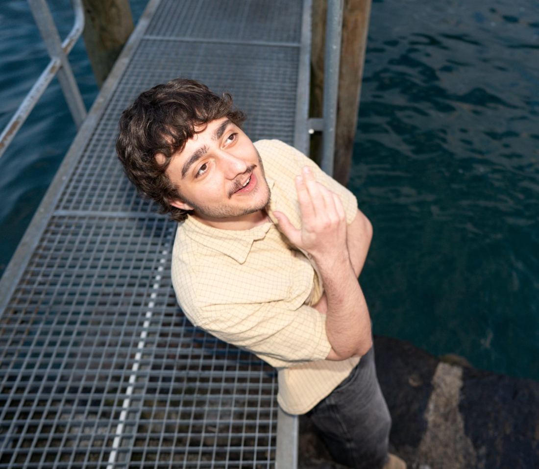
              Hi there, I'm Roel — welcome to my website. Have a look around. I'll start studying <strong>Mechanical Engineering at ETH</strong> this September; until then, I spend my time on photography, learning Chinese, and a handful of side projects.
            </p>
            <p className="wk-blurb-meet">
              Always glad to meet interesting people — feel free to say hi at <a href="mailto:roel.hotz@gmail.com">roel.hotz@gmail.com</a>.
            </p>
          </div>
        </div>
        <div className="wk-hero-r">
          <div className="photo-frame">
            <img src="photos/portrait.jpg" alt="Portrait of Roel" onError={(e) => {e.target.style.display = 'none';e.target.parentElement.classList.add('placeholder');}} />
          </div>
          <div className="corner-circle"></div>
        </div>
      </section>
      <section className="wk-twocol">
        <section className="left">
          <h3><span className="num">A.</span> Open <em>Questions</em></h3>
          <ul className="wk-questions">
            <li><a href="#question-01">Are livingrooms part of the universe?</a></li>
            <li><a href="#question-02">Can embedding matrices offer new insight into the meaning of terms?</a></li>
          </ul>
        </section>
        <section>
          <h3><span className="num">B.</span> <em>Explore</em></h3>
          <div className="wk-explore">
            <a href="#project-01"><span className="ttl">Analog Camera, from scratch</span><span className="arr">↗</span></a>
            <a href="#project-02"><span className="ttl">Modular Vertical Farm</span><span className="arr">↗</span></a>
            <a href="#project-03"><span className="ttl">Speaker Housing, redesigned</span><span className="arr">↗</span></a>
            <a href="#project-04"><span className="ttl">Custom Lens Adapter</span><span className="arr">↗</span></a>
            <a href="#project-05"><span className="ttl">Modular Penholder</span><span className="arr">↗</span></a>
          </div>
        </section>
      </section>
    </React.Fragment>;


  const WorkPage = () =>
  <React.Fragment>
      <header className="wk-pagetitle">
        <div className="num-block">
          <div className="circle" style={{ background: palette.red, color: palette.paper }}>01</div>
          <div className="label">Selected Work</div>
        </div>
        <h2>Things I made, wrote, <span className="alt">or</span> thought </h2>
      </header>
      <section className="wk-projects">
        {PROJECTS.map((p) =>
      <a className="wk-plate" key={p.n} href={`#${p.slug}`}>
            <div className="top"><div className="wk-plate-arrow">↗</div></div>
            <div className="wk-plate-icon"><Icon kind={p.icon} /></div>
            <h3>{p.t}</h3>
            <p>{p.d}</p>
          </a>
      )}
      </section>
    </React.Fragment>;


  const PhotosPage = () =>
  <React.Fragment>
      <header className="wk-pagetitle">
        <div className="num-block">
          <div className="circle" style={{ background: palette.blue, color: palette.paper }}>02</div>
          <div className="label">Photography</div>
        </div>
        <h2>Notes from <span className="alt">my</span> camera(s)</h2>

      </header>

      {/* INTRO */}
      <section className="wk-photo-intro">
        <div className="left">
          <h3>Through the <em>viewfinder</em>.</h3>
          <p>I started Photography out of curiosity and it turned into a passion. What pulls me in isn't only the image — it's the also mechanics behind it: the click of a shutter, the physics of a lens, and sometimes the elegance of a camera built decades before I was born. Analog cameras especially feel like small, beautifully resolved engineering problems.</p>
          <p>What follows is a (small) selection of my photos.</p>
        </div>
        <div className="right">
          <h4 style={{ fontFamily: "'JetBrains Mono', monospace", fontSize: '11px', letterSpacing: '0.2em', textTransform: 'uppercase', margin: '0 0 20px', color: palette.ink }}>The Cameras</h4>
          <div className="wk-photo-meta"><span>Digital</span><strong>Sony A7iv</strong></div>
          <div className="wk-photo-meta"><span>Analog · in use</span><strong>Canon AT-1 · Canon EOS 500 · Zeiss Ikon Contaflex · Foth 105mm</strong></div>
          <div className="wk-photo-meta"><span>Analog · archive</span><strong>Kodak Retinette 1B · Voigtländer VITO CL · Voigtländer VITORET DR · Regula III B · Kodak Instamatic 500 · Kodak Retina II</strong></div>
        </div>
      </section>

      {/* GALLERY — natural aspect ratios, no cropping */}
      <section className="wk-gallery">
        <div className="wk-gallery-cols">
          <div className="col">
            <figure className="wk-photo-nat">
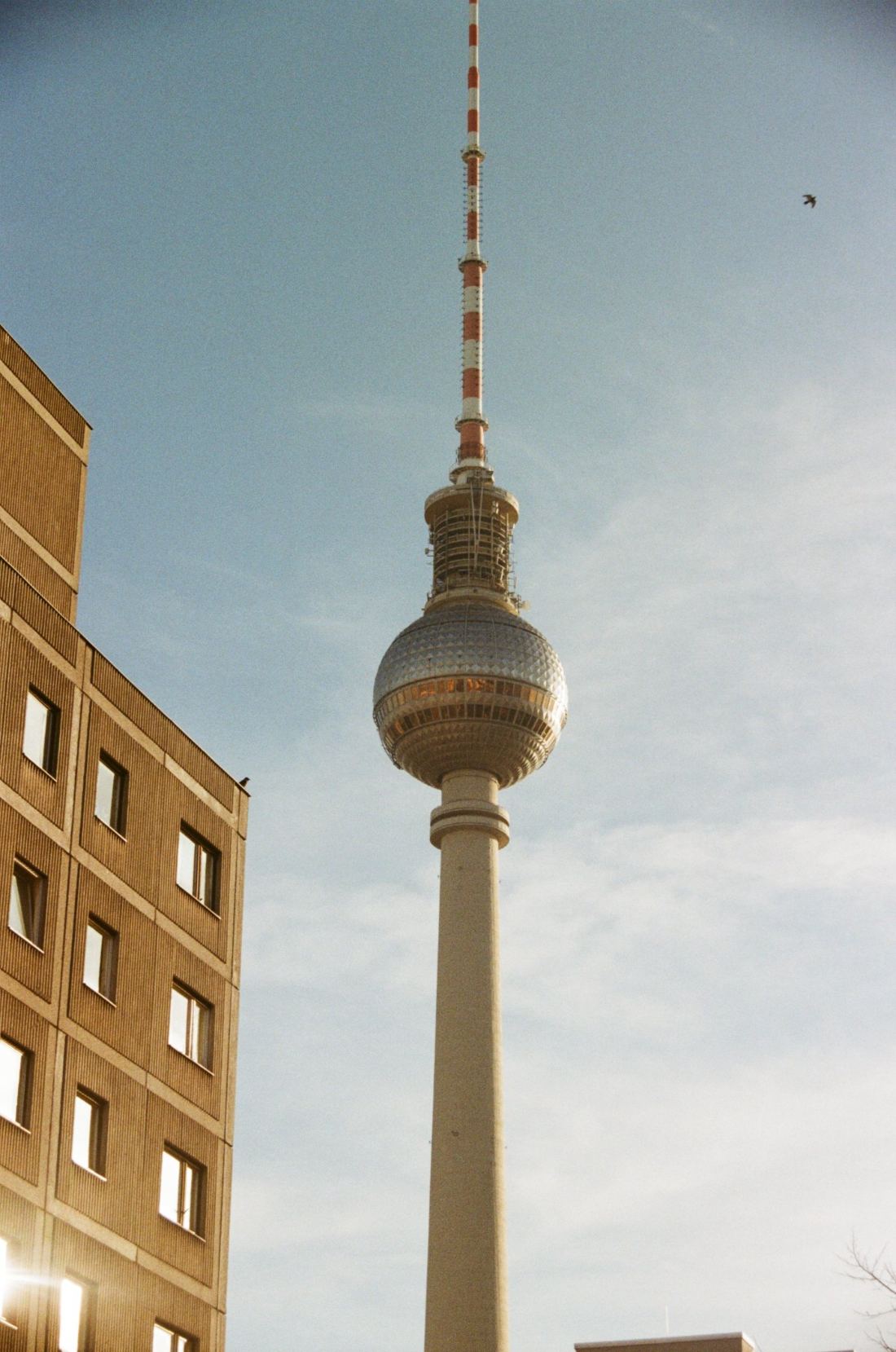
              <img src="photos/berlin-tower.jpg" alt="" style={{ aspectRatio: '1400 / 2112' }} />
              <figcaption><span className="loc">BERLIN · FEBRUARY 2026</span><span className="med">35MM · CANON EOS 500</span></figcaption>
            </figure>
            <figure className="wk-photo-nat">
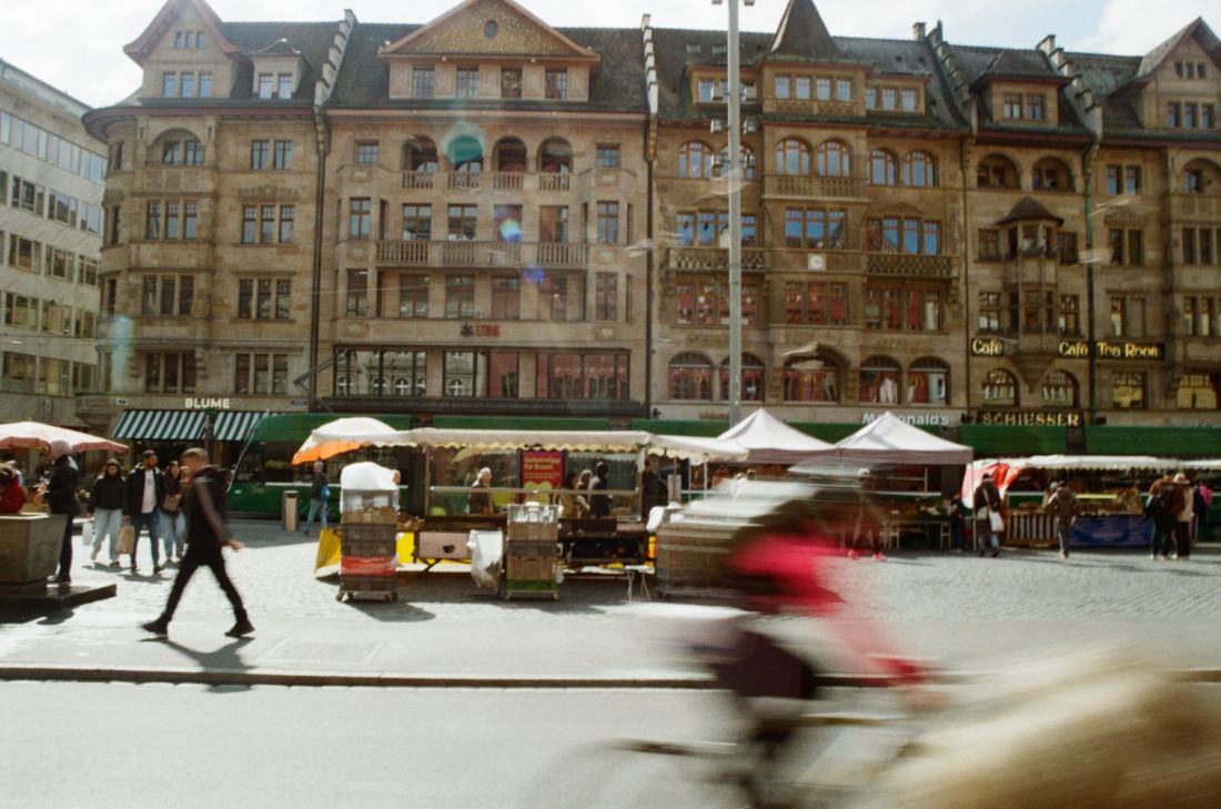
              <img src="photos/basel-market.jpg" alt="" style={{ aspectRatio: '1400 / 928' }} />
              <figcaption><span className="loc">BASEL · SPRING 2026</span><span className="med">35MM · CANON EOS 500</span></figcaption>
            </figure>
            <figure className="wk-photo-nat">
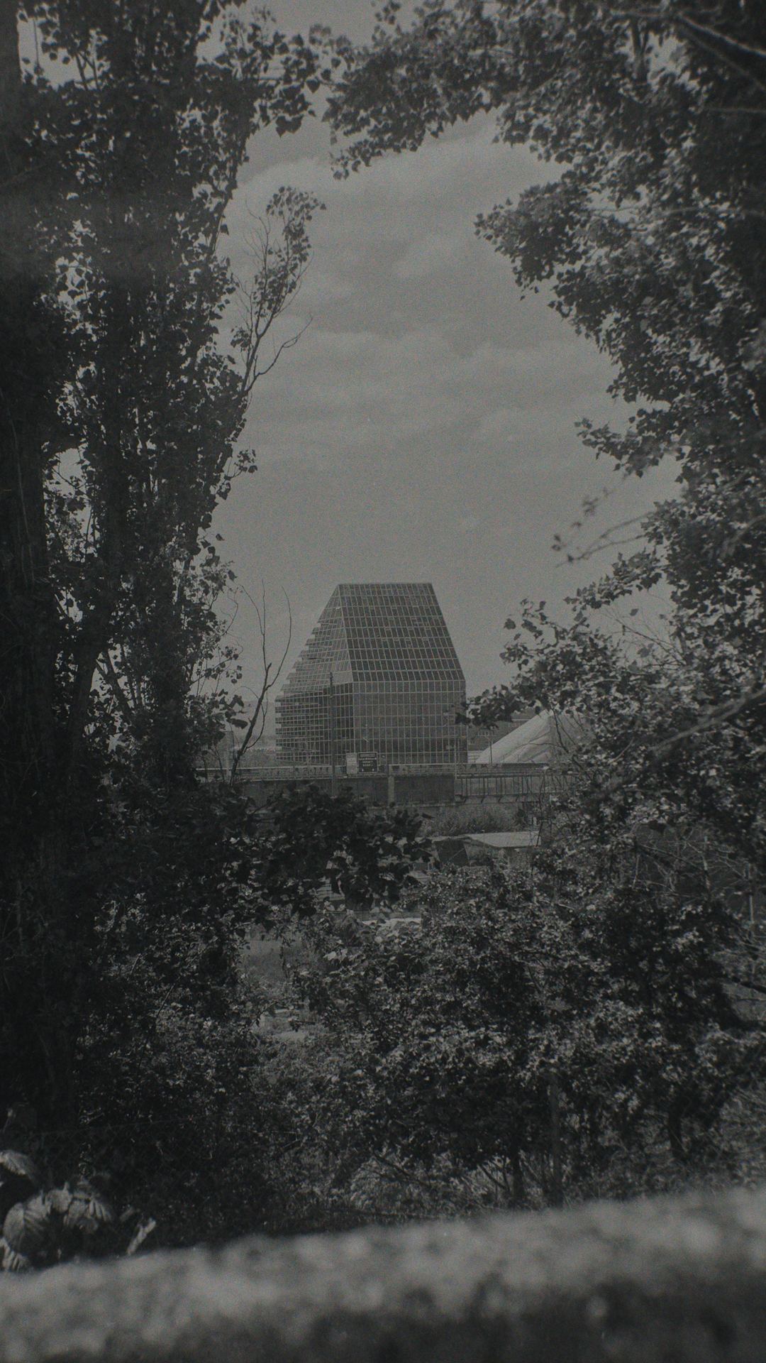
              <img src="photos/basel-roche.jpg" alt="" style={{ aspectRatio: '1080 / 1920' }} />
              <figcaption><span className="loc">BASEL · SPRING 2025</span><span className="med">120 · FOTH 105MM</span></figcaption>
            </figure>
            <figure className="wk-photo-nat">
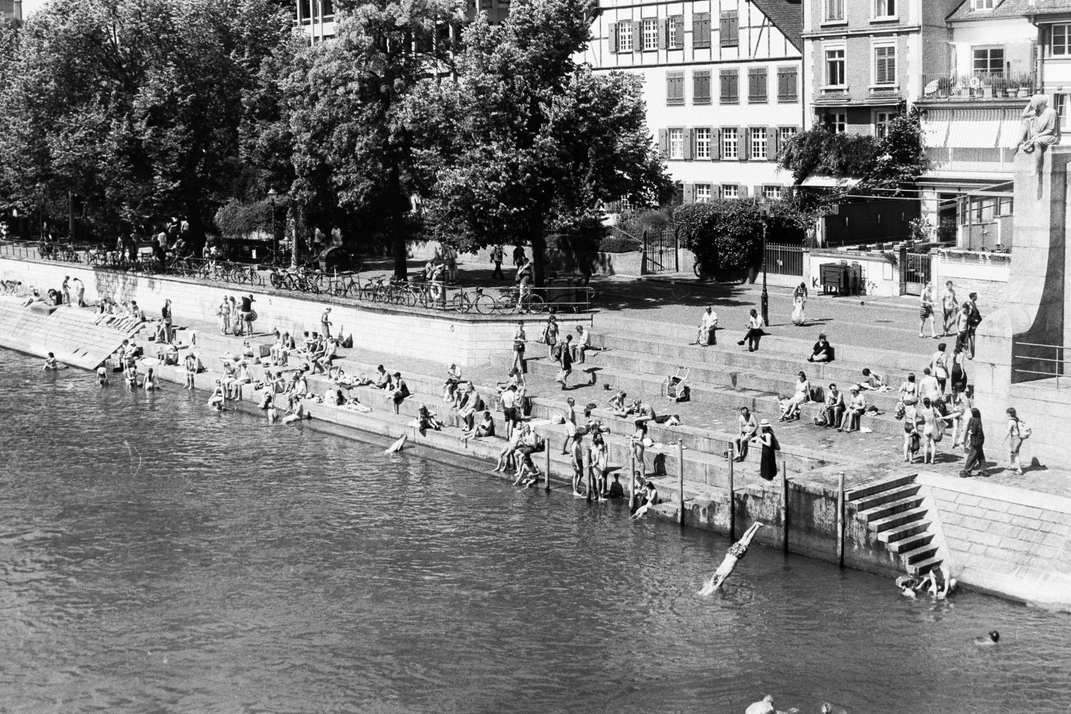
              <img src="photos/rhine-swim.jpg" alt="" style={{ aspectRatio: '1500 / 1000' }} />
              <figcaption><span className="loc">BASEL · SUMMER 2025</span><span className="med">35MM · CANON AT-1</span></figcaption>
            </figure>
            <figure className="wk-photo-nat">
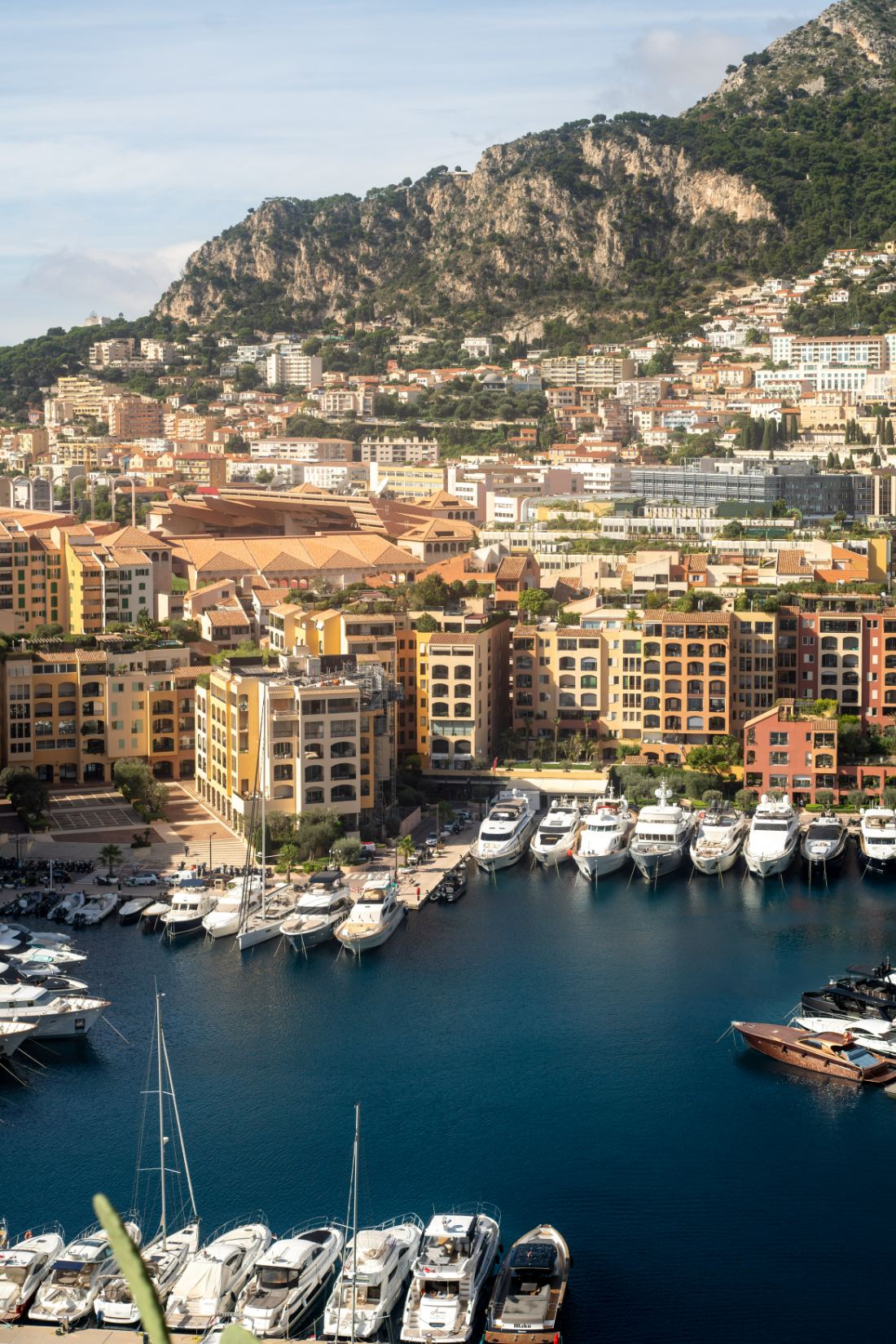
              <img src="photos/monaco-harbor.jpg" alt="" style={{ aspectRatio: '1100 / 1650' }} />
              <figcaption><span className="loc">MONACO · 2024</span><span className="med">DIGITAL · A7IV</span></figcaption>
            </figure>
            <figure className="wk-photo-nat">
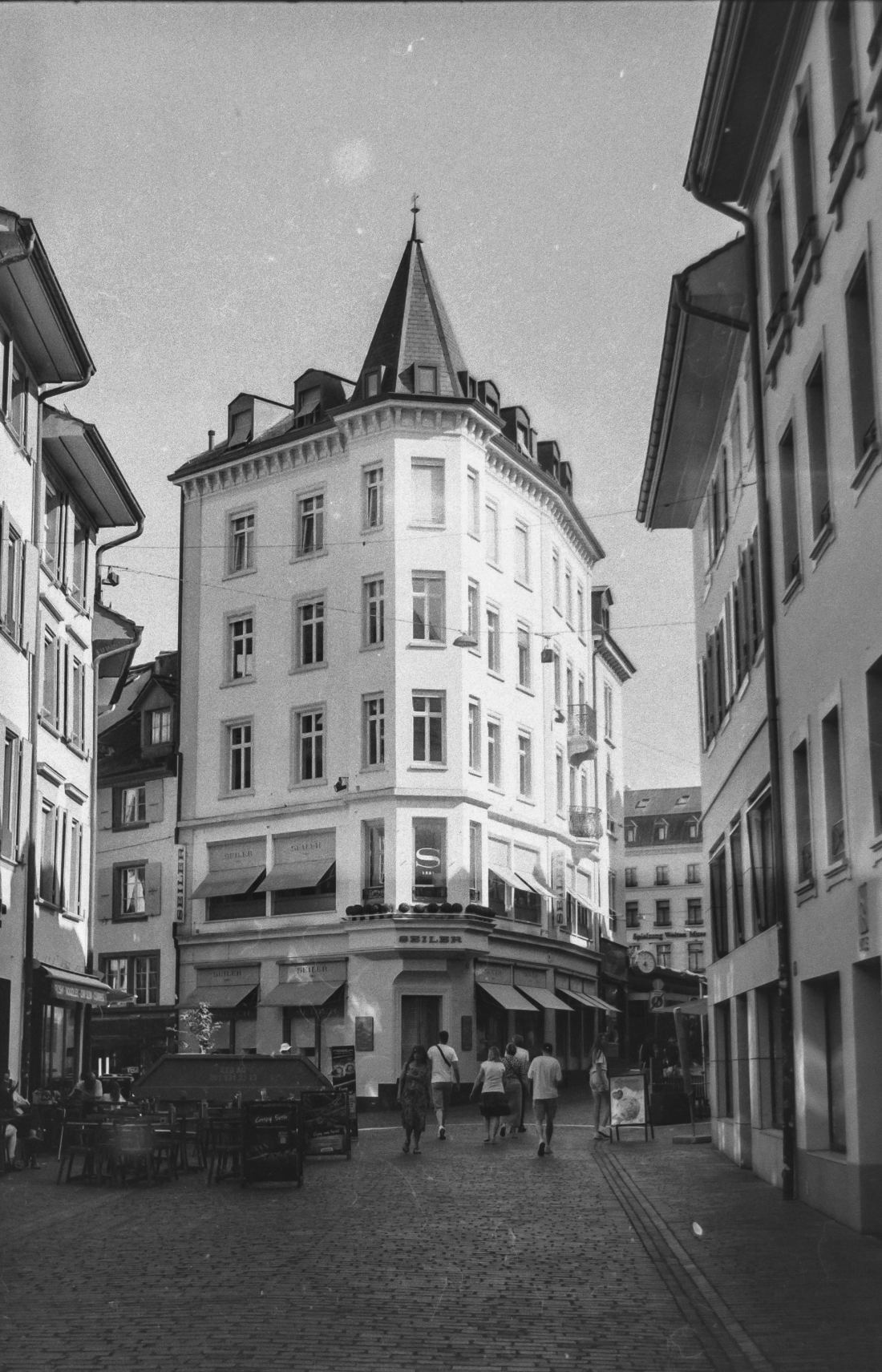
              <img src="photos/basel-oldtown.jpg" alt="" style={{ aspectRatio: '1100 / 1711' }} />
              <figcaption><span className="loc">BASEL · 2025</span><span className="med">35MM · ZEISS IKON CONTAFLEX</span></figcaption>
            </figure>
            <figure className="wk-photo-nat">
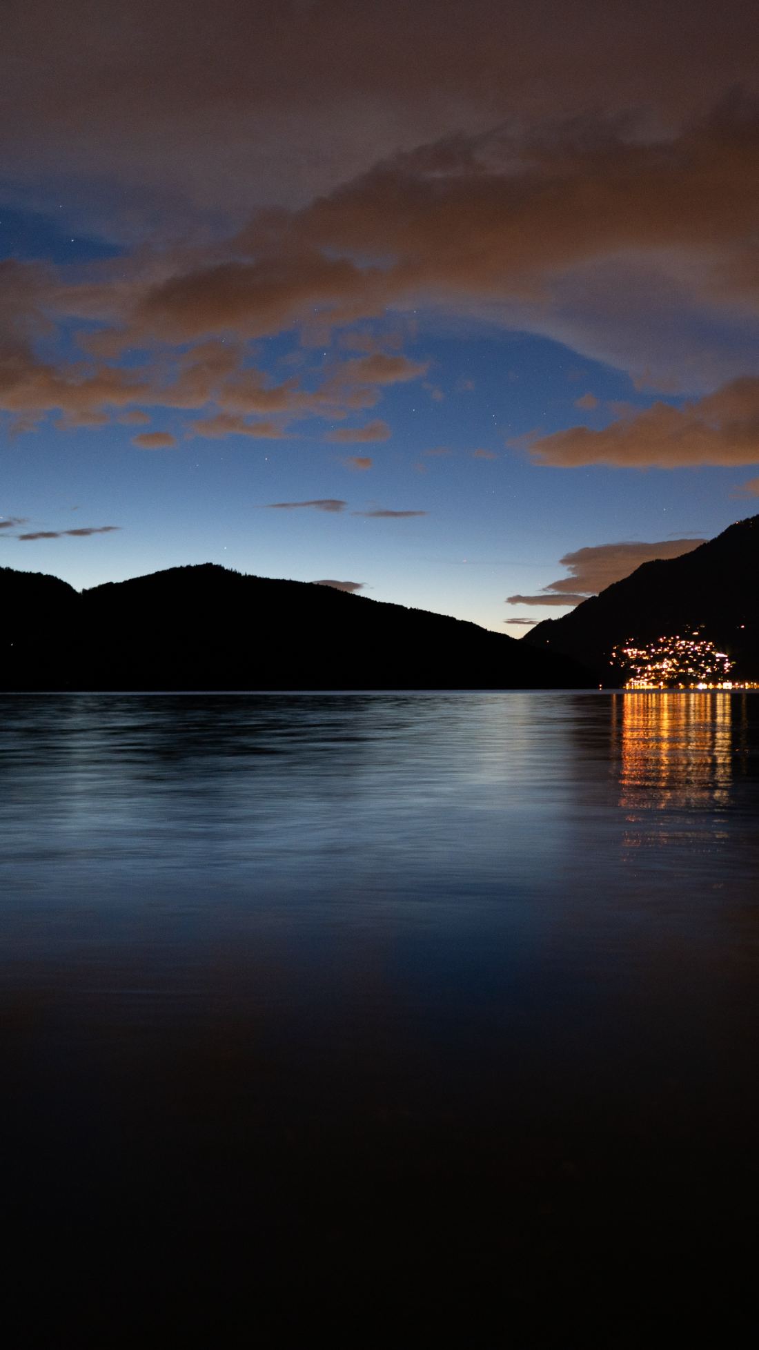
              <img src="photos/lake-dusk.jpg" alt="" style={{ aspectRatio: '1100 / 1956' }} />
              <figcaption><span className="loc">LAKE LUCERNE · SPRING 2026</span><span className="med">DIGITAL · A7IV</span></figcaption>
            </figure>
            <figure className="wk-photo-nat">
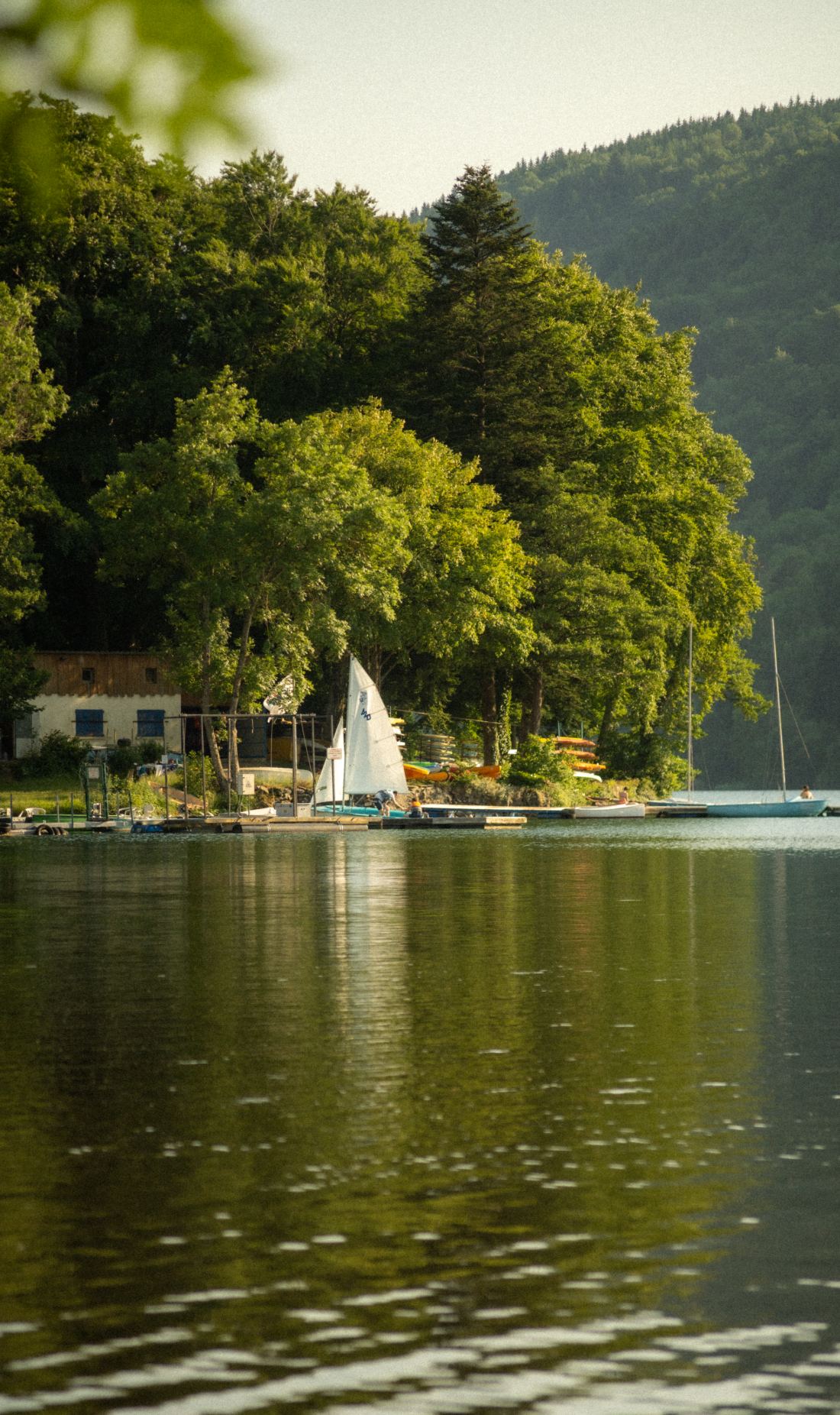
              <img src="photos/lake-sailboat.jpg" alt="" style={{ aspectRatio: '1100 / 1852' }} />
              <figcaption><span className="loc">SOMEWHERE IN FRANCE · 2025</span><span className="med">DIGITAL · A7IV</span></figcaption>
            </figure>
            <figure className="wk-photo-nat">
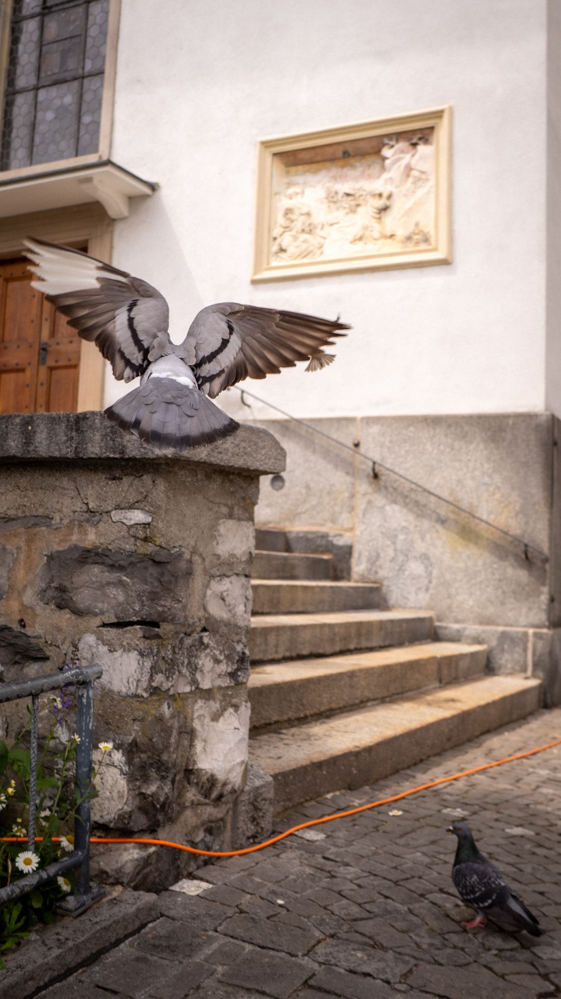
              <img src="photos/pigeon.jpg" alt="" style={{ aspectRatio: '1100 / 1957' }} />
              <figcaption><span className="loc">LUCERNE · 2024</span><span className="med">DIGITAL · A7IV</span></figcaption>
            </figure>
          </div>
          <div className="col">
            <figure className="wk-photo-nat">
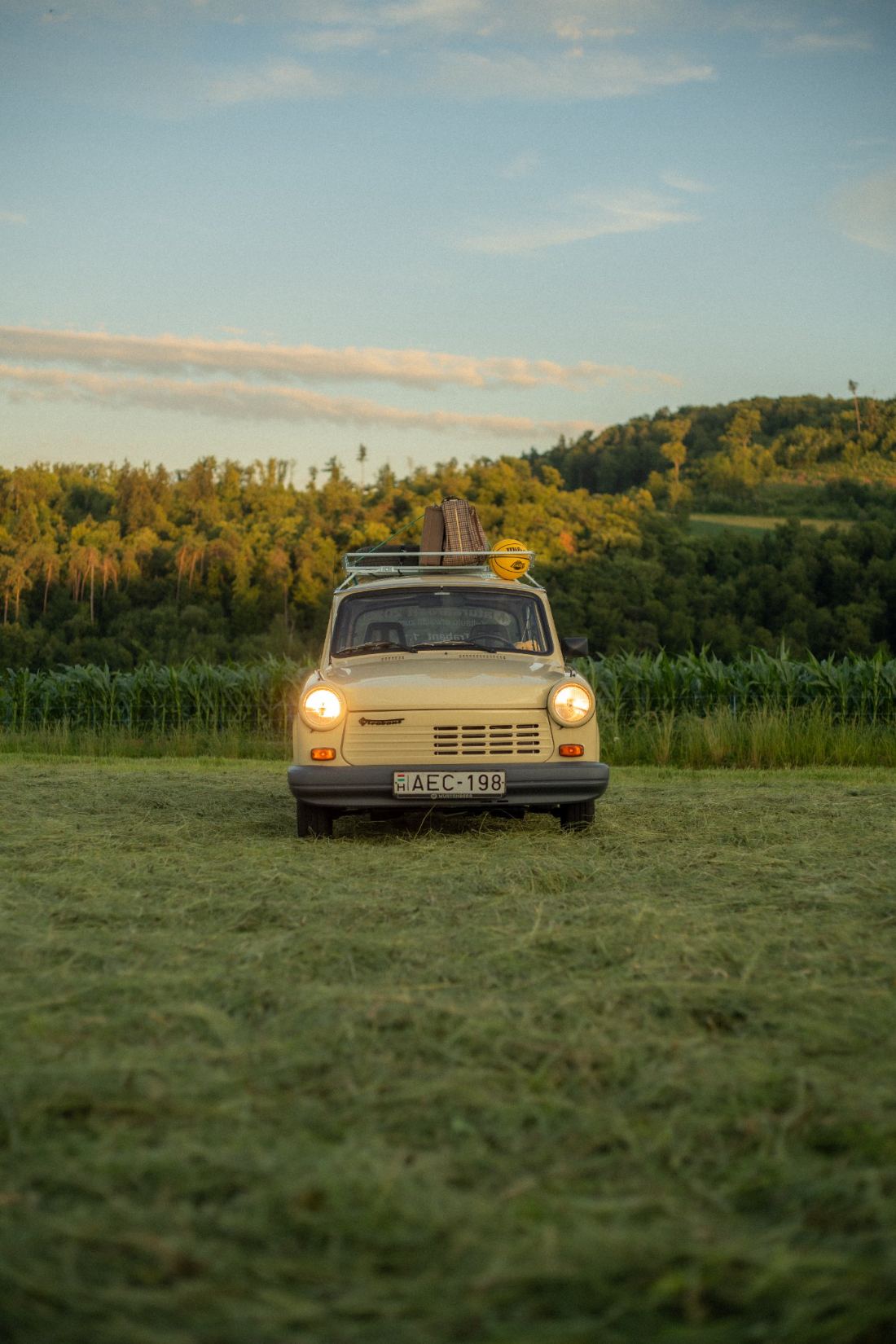
              <img src="photos/trabant.jpg" alt="" style={{ aspectRatio: '1400 / 2100' }} />
              <figcaption><span className="loc">BASEL · SUMMER 2025</span><span className="med">DIGITAL · SONY A7IV</span></figcaption>
            </figure>
            <figure className="wk-photo-nat">
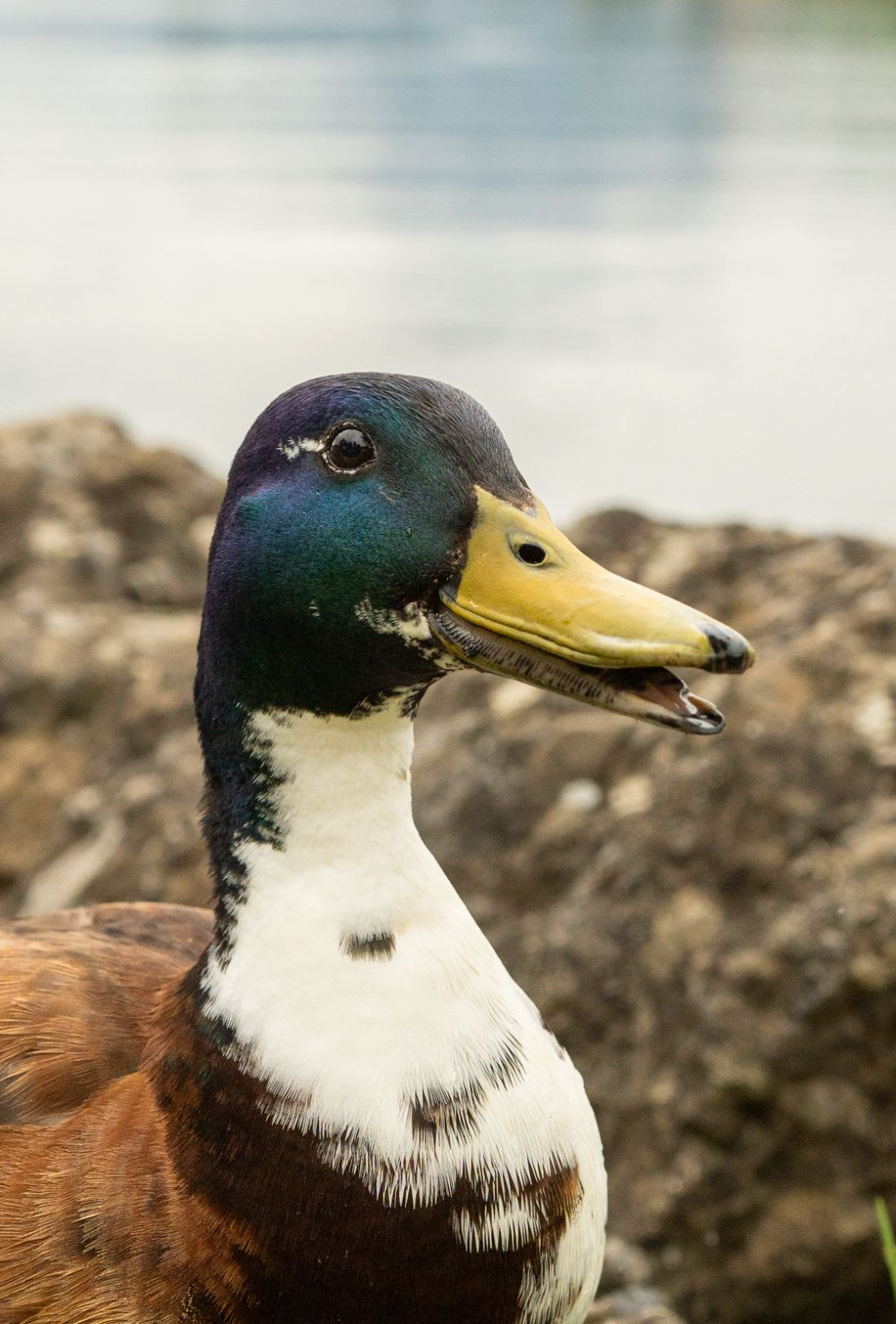
              <img src="photos/duck.jpg" alt="" style={{ aspectRatio: '1100 / 1626' }} />
              <figcaption><span className="loc">AT SOME LAKE · 2025</span><span className="med">DIGITAL · A7IV</span></figcaption>
            </figure>
            <figure className="wk-photo-nat">
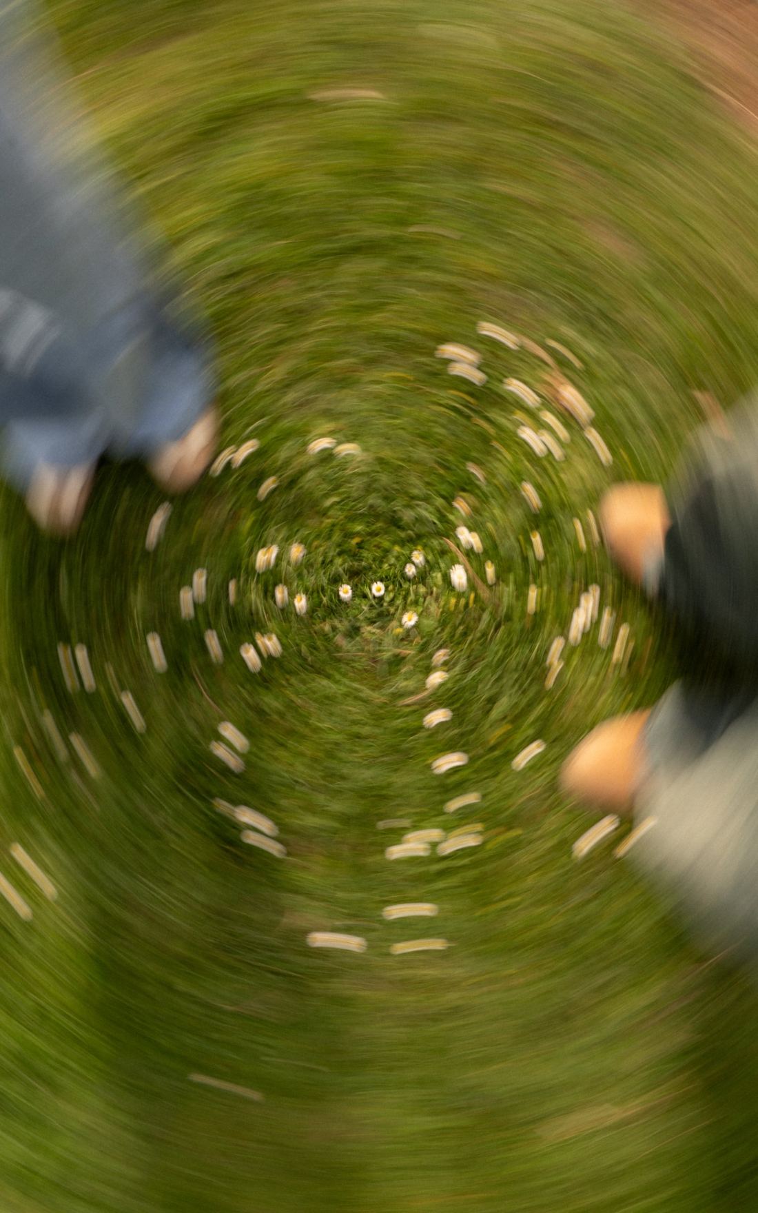
              <img src="photos/spinning-meadow.jpg" alt="" style={{ aspectRatio: '1400 / 2240' }} />
              <figcaption><span className="loc">THUN · 2026</span><span className="med">DIGITAL · A7IV</span></figcaption>
            </figure>
            <figure className="wk-photo-nat">
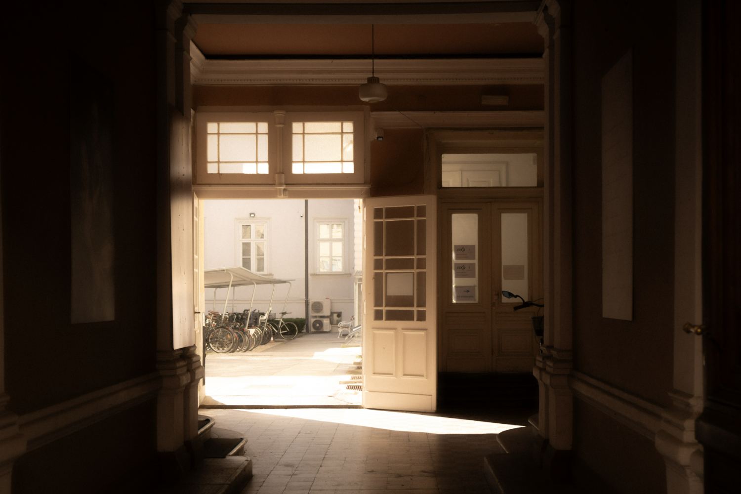
              <img src="photos/doorway.jpg" alt="" style={{ aspectRatio: '1500 / 1000' }} />
              <figcaption><span className="loc">LJUBLJANA · 2025</span><span className="med">DIGITAL · A7IV</span></figcaption>
            </figure>
            <figure className="wk-photo-nat">
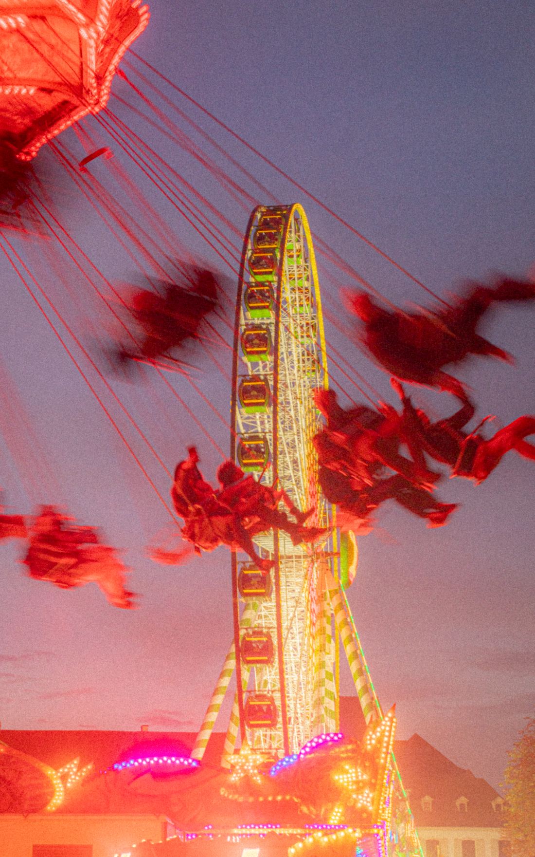
              <img src="photos/fair-night.jpg" alt="" style={{ aspectRatio: '1100 / 1760' }} />
              <figcaption><span className="loc">BASEL · FALL 2024</span><span className="med">DIGITAL · A7IV</span></figcaption>
            </figure>
            <figure className="wk-photo-nat">
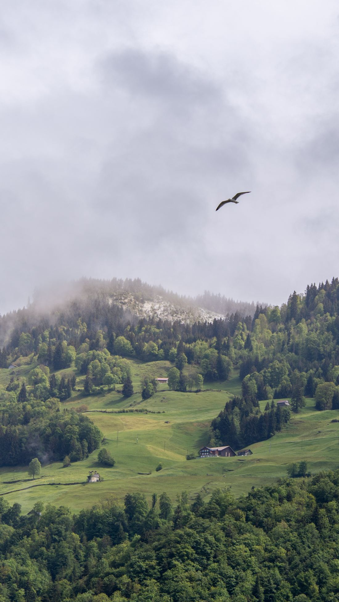
              <img src="photos/mountain-bird.jpg" alt="" style={{ aspectRatio: '1100 / 1955' }} />
              <figcaption><span className="loc">NEAR LAKE LUCERNE · SPRING 2026</span><span className="med">DIGITAL · A7IV</span></figcaption>
            </figure>
            <figure className="wk-photo-nat">
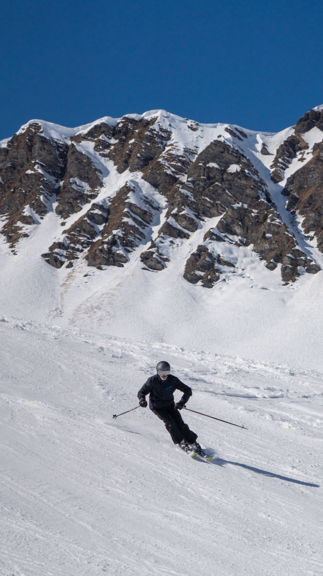
              <img src="photos/alps-skier.jpg" alt="" style={{ aspectRatio: '1100 / 1960' }} />
              <figcaption><span className="loc">PORTES DU SOLEIL · WINTER 2024</span><span className="med">DIGITAL · A7IV</span></figcaption>
            </figure>
            <figure className="wk-photo-nat">
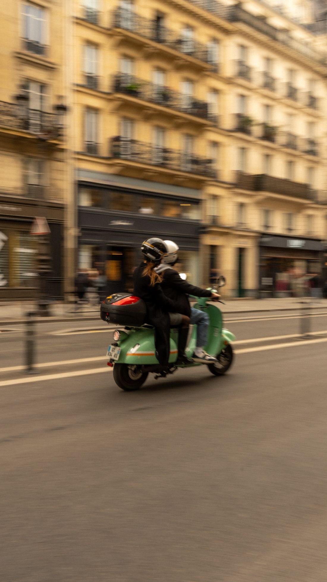
              <img src="photos/paris-vespa.jpg" alt="" style={{ aspectRatio: '1100 / 1956' }} />
              <figcaption><span className="loc">PARIS · 2025</span><span className="med">DIGITAL · A7IV</span></figcaption>
            </figure>
            <figure className="wk-photo-nat">
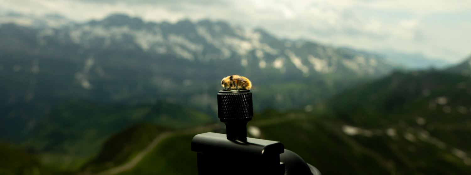
              <img src="photos/mountain-bee.jpg" alt="" style={{ aspectRatio: '1500 / 558' }} />
              <figcaption><span className="loc">CHAMPERY · 2024</span><span className="med">DIGITAL · A7IV</span></figcaption>
            </figure>
          </div>
        </div>
      </section>
    </React.Fragment>;


  const CVPage = () =>
  <React.Fragment>
      <header className="wk-pagetitle">
        <div className="num-block">
          <div className="circle" style={{ background: palette.yellow, color: palette.ink }}>03</div>
          <div className="label">Curriculum Vitae</div>
        </div>
        <h2>Roel <span className="alt">Jeremy</span> Hotz</h2>
        <div className="meta">Updated April '26</div>
      </header>
      <section className="wk-cv">
        <div className="wk-cv-side">
          <div className="cv-portrait">
            <image-slot id="cv-portrait" shape="rect" src="photos/portrait-cv.jpg" placeholder="Drop portrait"></image-slot>
          </div>
          <div className="ident-block">
            <h4>Contact</h4>
            <p>
              <a href="mailto:roel.hotz@gmail.com">roel.hotz@gmail.com</a><br />
              Basel, Switzerland
            </p>
          </div>

          <div className="ident-block">
            <h4>Born</h4>
            <p>2005 · Basel, CH<br />Swiss citizen</p>
          </div>

          <div className="ident-block">
            <h4>Languages</h4>
            <div className="lang-row"><span>German</span><span>Native</span></div>
            <div className="lang-row"><span>English</span><span>Fluent</span></div>
            <div className="lang-row"><span>French</span><span>B1 / B2</span></div>
            <div className="lang-row"><span>Chinese 中文</span><span>HSK 2</span></div>
          </div>

          <div className="ident-block">
            <h4>Skills</h4>
            <div className="skill-group">
              <div className="skill-label">3D / CAD</div>
              <p>Blender · Fusion 360 · 3D printing</p>
            </div>
            <div className="skill-group">
              <div className="skill-label">Photography</div>
              <p>Analog · Digital · Lightroom</p>
            </div>
            <div className="skill-group">
              <div className="skill-label">Office</div>
              <p>Word · Excel · PowerPoint</p>
            </div>
          </div>
        </div>

        <div className="wk-cv-list">
          <div className="wk-cv-section">
            <div className="head"><span className="num">I.</span><h3>Education</h3></div>
            {[
          { yr: '09.2026 →', t: 'B.Sc. Mechanical Engineering', sub: 'Eidgenössische Technische Hochschule (ETH)', place: 'Zürich' },
          { yr: '08.2021 — 06.2025', t: 'Matura, Schwerpunkt Anwendungen der Mathematik und Physik', sub: 'Gymnasium Muttenz — GPA 5.42 / 6  ·  Schülerstudium (Philosophie)', place: 'Muttenz' }].
          map((e, i) =>
          <div className="wk-cv-row" key={i}>
                <div className="yr">{e.yr}</div>
                <div className="what">{e.t}<em>{e.sub}</em></div>
                <div className="place">{e.place}</div>
              </div>
          )}
          </div>

          <div className="wk-cv-section">
            <div className="head"><span className="num">II.</span><h3>Work Experience</h3></div>
            {[
          { yr: '08.2025 →', t: 'Coach', sub: 'ICT Scouts — mentoring young IT talents', place: 'Switzerland' },
          { yr: '08.2021 — 08.2025', t: 'Junior Coach', sub: 'ICT Scouts — mentoring young IT talents', place: 'Switzerland' }].
          map((e, i) =>
          <div className="wk-cv-row" key={i}>
                <div className="yr">{e.yr}</div>
                <div className="what">{e.t}<em>{e.sub}</em></div>
                <div className="place">{e.place}</div>
              </div>
          )}
          </div>

          <div className="wk-cv-section">
            <div className="head"><span className="num">III.</span><h3>Awards & Selected Activities</h3></div>
            {[
          { yr: '2026', t: 'Young European Security Conference', sub: 'Selected as one of 200 young Europeans for a three-day conference on European security & policy', place: 'Berlin' },
          { yr: '2025', t: 'Baselbieter Maturandenpreis', sub: 'Top 5 of 146', place: 'Muttenz' },
          { yr: '2023', t: 'Science on the Move — 2nd Place', sub: <React.Fragment>National science competition for high-school students. Team leader of my class — the <a href="#project-02" style={{ color: palette.red, textDecoration: 'none', borderBottom: `1px solid ${palette.red}` }}>modular vertical farming system</a> was developed during this project.</React.Fragment>, place: 'Switzerland' },
          { yr: '2018 — 2021', t: 'ICT Scouts', sub: 'Participant in the STEM promotion programme', place: 'Switzerland' }].
          map((e, i) =>
          <div className="wk-cv-row" key={i}>
                <div className="yr">{e.yr}</div>
                <div className="what">{e.t}<em>{e.sub}</em></div>
                <div className="place">{e.place}</div>
              </div>
          )}
          </div>
        </div>
      </section>
    </React.Fragment>;


  const ContactPage = () =>
  <React.Fragment>
      <header className="wk-pagetitle">
        <div className="num-block">
          <div className="circle" style={{ background: palette.ink, color: palette.paper }}>04</div>
          <div className="label">Contact</div>
        </div>
        <h2>Say <span className="alt">hello.</span></h2>

      </header>
      <section className="wk-contact">
        <div className="wk-contact-l">
          <h3>For questions, ideas, or just a <em>hello</em>.</h3>
          <a className="mail" href="mailto:roel.hotz@gmail.com">roel.hotz@gmail.com</a>
        </div>
        <div className="wk-contact-r">
          <h4>Elsewhere</h4>
          <a href="https://ch.linkedin.com/in/roel-hotz-73b50b21a">LinkedIn</a>
        </div>
      </section>
    </React.Fragment>;


  const ProjectPage = ({ slug }) => {
    const idx = PROJECTS.findIndex((p) => p.slug === slug);
    const p = PROJECTS[idx];
    if (!p) return null;
    const prev = PROJECTS[(idx - 1 + PROJECTS.length) % PROJECTS.length];
    const next = PROJECTS[(idx + 1) % PROJECTS.length];
    const accentBg = idx % 2 === 0 ? palette.red : palette.blue;
    return (
      <React.Fragment>
        <nav className="wk-proj-back">
          <a href="#work">← Work</a>
          <span className="sep">/</span>
          <span style={{ color: palette.muted }}>{p.t}</span>
        </nav>
        <section className="wk-proj-hero">
          <div className="left">
            <h1>{p.t.split(',')[0]}{p.t.includes(',') ? <React.Fragment>,<br /><em>{p.t.split(',').slice(1).join(',').trim()}</em></React.Fragment> : null}</h1>
            <p className="lead">{p.lead}</p>
          </div>
          <div className="right">
            <div className="frame"><Icon kind={p.icon} /></div>
            <div className="corner" style={{ background: accentBg }}></div>
          </div>
        </section>
        <section className="wk-proj-meta two">
          <div><h5>Status</h5><p>{p.status}</p></div>
          <div><h5>Year</h5><p>{p.year}</p></div>
        </section>
        <section className="wk-proj-body single">
          <div className="narrative">
            <h3><span className="num">A.</span> The <em>brief</em>.</h3>
            {p.story.map((para, i) => <p key={i}>{para}</p>)}
          </div>
        </section>
        <section className="wk-proj-gallery">
          <div className="gallery-head">
            <h3><span className="num">B.</span> In <em>pictures</em>.</h3>
            {!p.media && <span className="hint">Drag an image onto a frame</span>}
          </div>
          <div className="gallery-grid">
            {p.media ? (
              p.media.map((m, i) => (
                <figure className="wk-photo-nat" key={i}>
                  {m.kind === 'image' && (
                    <img src={m.src} alt={m.label} loading="lazy" />
                  )}
                  {m.kind === 'video' && (
                    <video src={m.src} controls playsInline preload="metadata">
                      Your browser does not support video playback.
                    </video>
                  )}
                  <figcaption><span className="loc">{m.loc.toUpperCase()}</span><span className="med">{m.label.toUpperCase()}</span></figcaption>
                </figure>
              ))
            ) : (
              <React.Fragment>
                <figure className="wk-photo-nat">
                  <image-slot id={`${p.slug}-img-1`} shape="rect" fit="contain" placeholder="Drop photo · hero" style={{ aspectRatio: '3 / 2' }}></image-slot>
                  <figcaption><span className="loc">{p.tag.toUpperCase()}</span><span className="med">HERO</span></figcaption>
                </figure>
                <figure className="wk-photo-nat">
                  <image-slot id={`${p.slug}-img-2`} shape="rect" fit="contain" placeholder="Drop photo · process" style={{ aspectRatio: '3 / 2' }}></image-slot>
                  <figcaption><span className="loc">{p.tag.toUpperCase()}</span><span className="med">PROCESS</span></figcaption>
                </figure>
                <figure className="wk-photo-nat">
                  <image-slot id={`${p.slug}-img-3`} shape="rect" fit="contain" placeholder="Drop photo · detail" style={{ aspectRatio: '3 / 2' }}></image-slot>
                  <figcaption><span className="loc">{p.tag.toUpperCase()}</span><span className="med">DETAIL</span></figcaption>
                </figure>
                <figure className="wk-photo-nat">
                  <image-slot id={`${p.slug}-img-4`} shape="rect" fit="contain" placeholder="Drop photo · in situ" style={{ aspectRatio: '3 / 2' }}></image-slot>
                  <figcaption><span className="loc">{p.tag.toUpperCase()}</span><span className="med">IN SITU</span></figcaption>
                </figure>
              </React.Fragment>
            )}
          </div>
        </section>
        <section className="wk-proj-next">
          <a className="prev" href={`#${prev.slug}`}>
            <span className="lbl">← Previous</span>
            <span className="ttl">{prev.t}</span>
          </a>
          <a className="next" href={`#${next.slug}`}>
            <span className="lbl">Next →</span>
            <span className="ttl">{next.t}</span>
          </a>
        </section>
      </React.Fragment>);

  };


  const QuestionPage = ({ slug }) => {
    const idx = QUESTIONS.findIndex((q) => q.slug === slug);
    const q = QUESTIONS[idx];
    if (!q) return null;
    const other = QUESTIONS[(idx + 1) % QUESTIONS.length];
    return (
      <React.Fragment>
        <nav className="wk-q-back">
          <a href="#home">← Home</a>
          <span className="sep">/</span>
          <span style={{ color: palette.muted }}>Open question</span>
        </nav>
        <section className="wk-q-hero">
          <div className="mark">?</div>
          <div className="text">
            <h1><em>{q.title}</em></h1>
          </div>
        </section>
        <section className="wk-q-body single">
          <div className="essay">
            <p style={{ fontStyle: 'italic', color: palette.muted }}>This site isn't complete yet.</p>
          </div>
        </section>
        <nav className="wk-q-next">
          <a href="#home">← All questions</a>
          <a href={`#${other.slug}`}>Next question <span className="ttl">{other.title}</span></a>
        </nav>
      </React.Fragment>);

  };


  return (
    <div className="wk-root">
      <style>{css}</style>

      <header className={`wk-header ${route !== 'home' ? 'with-name' : 'no-name'}`}>
        <div className="wk-mark" onClick={() => {window.location.hash = 'home';}}>R</div>
        {route !== 'home' && <div className="wk-header-name">Roel J. Hotz</div>}
        <div className="wk-nav">
          {navLink('home', 'Home')}
          {navLink('work', 'Work')}
          {navLink('photos', 'Photography')}
          {navLink('cv', 'CV')}
          {navLink('contact', 'Contact')}
        </div>
        <div className="wk-toggle" onClick={() => setTheme(dark ? 'light' : 'dark')}>{dark ? '☼' : '◐'}</div>
      </header>

      {route === 'home' && <div className="wk-namebar">Roel J. Hotz</div>}

      <main className="wk-main">
        {route === 'home' && <HomePage />}
        {route === 'work' && <WorkPage />}
        {route === 'photos' && <PhotosPage />}
        {route === 'cv' && <CVPage />}
        {route === 'contact' && <ContactPage />}
        {route.startsWith('project-') && <ProjectPage slug={route} />}
        {route.startsWith('question-') && <QuestionPage slug={route} />}
      </main>

      <footer className="wk-foot">
        <div>
          <h4>Mail</h4>
          <div className="big">roel.hotz@gmail.com</div>
        </div>
        <div>
          <h4>Elsewhere</h4>
          <a href="https://ch.linkedin.com/in/roel-hotz-73b50b21a">LinkedIn</a>
        </div>
      </footer>
    </div>);

};

window.WerkblattC = WerkblattC;